
D3E Core
Introduction
D3EStudio provides users with a core project known as D3ECore, which encompasses essential components such as core models, data queries, option sets, classes, widgets, and structs. This user guide offers a comprehensive overview of D3ECore, detailing its key components and emphasizing user access and permissions related to these core objects.
The D3E Core folder is a fundamental component visible in your project explorer tree within the project.
OverviewPage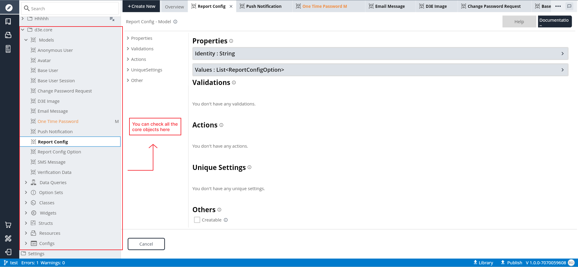
D3E Core Folder Contents
The D3E Core folder encompasses critical objects that serve as foundational elements for D3EStudio development. Users can explore and reference these objects as needed for their projects. The primary objects found within the D3E Core folder include:
Core Models: Central models essential for D3EStudio functionalities.
Data Queries: Predefined data queries for common functionalities.
Option Sets: Essential option sets used in various contexts.
Classes: Core classes providing foundational functionalities.
Widgets: Core UI components integral to D3EStudio.
Structs: Core structs used for temporary data holding.
Navigating the D3E Core Folder
Step 1: Locate and expand the D3E Core folder in the project explorer tree.
Step 2: Explore the contents of the D3E Core folder, including core models, data queries, option sets, classes, widgets, and structs.
Step 3: Leverage core models, data queries, option sets, classes, widgets, and structs as references in your project.
Step 4: View the configurations, structures, and details of core objects to understand their functionalities.
Step 5: Adhere to view-only access for core objects, refraining from editing or deleting these foundational elements.
Step 6: Organize your project by referencing and utilizing core objects from the D3E Core folder.
Conclusion
The D3E Core folder serves as a central repository for foundational elements within D3EStudio. By navigating this folder, users can access critical models, data queries, option sets, classes, widgets, and structs to enhance their development process. Utilizing these core objects as references fosters a standardized and efficient approach to D3EStudio development.
Core Widgets
Calendar View
The Calendar View widget in D3E Studio provides a graphical representation of a calendar, allowing users to view and interact with dates. This widget is useful for scenarios where a date selection is required, such as in scheduling applications or event management.
The Calendar View widget is employed in applications where users need to interact with dates, such as selecting a date for scheduling appointments, creating events, or navigating through a date-based interface. It provides a visual representation of the calendar, with customizable colors for selected and hovered dates, enhancing the user experience.
Properties of Calendar View Widget
1. Input:
- Type: Date
- Description: Specifies the type of input for the calendar.
2. SelectedColor:
- Type: Color
- Description: Sets the color for selected dates in the calendar.
3. HoverColor:
- Type: Color
- Description: Defines the color when hovering over dates in the calendar.
4. SelectedTextColor:
- Type: Color
- Description: Specifies the text color for selected dates.
5. HoverTextColor:
- Type: Color
- Description: Sets the text color when hovering over dates.
6. Enable Date:
- Type: Date
- Description: Allows developers to enable specific dates in the calendar.
Events of Calendar View Widget
1. onDateSelected:
- Parameter: Date
- Type: Date
- Description: Triggered when a date is selected in the calendar. It provides the selected date as a parameter.
Example Usage
CalendarView(
  input: Date.today(),
  selectedColor: Colors.blue,
  hoverColor: Colors.lightBlue,
  selectedTextColor: Colors.white,
  hoverTextColor: Colors.white,
  enableDate: Date(2023, 12, 31),
  onDateSelected: (selectedDate) {
    print('Selected Date: $selectedDate');
    // Perform actions based on the selected date.
  },
);
In this example, a Calendar View widget is created with various properties set to customize its appearance and behavior. The onDateSelected event is used to handle actions when a date is selected.
The Calendar View widget is a powerful tool for incorporating date-related functionality into your D3E Studio projects, providing a visually appealing and interactive calendar for users.
Date Field
The Date Field widget in D3E Studio facilitates the user entry of dates, allowing input via both hardware and on-screen keyboards. It provides a versatile and user-friendly interface for selecting and modifying dates within your application.
Properties of Date Field Widget
1. Value:
- Type: Date
- Description: Represents the current value or selected date in the field.
2. PlaceHolder:
- Type: String
- Description: Displays a placeholder text when the date field is empty.
3. Format:
- Type: String
- Description: Defines the format for displaying the date in the field.
4. ActiveColor:
- Type: Color
- Description: Specifies the color when the date field is active or focused.
5. CornerRadius:
- Type: Double
- Description: Sets the corner radius of the date field.
6. InActiveColor:
- Type: Color
- Description: Defines the color when the date field is inactive or not focused.
7. Padding:
- Type: EdgeInsets
- Description: Determines the padding of the date field.
8. Disable:
- Type: Boolean
- Description: Disables or enables the date field based on the boolean value.
Events of Date Field Widget
1. onChanged:
- Parameter: Date
- Type: Date
- Description: Triggered when the user changes the date in the field. It provides the updated date as a parameter.
Example Usage
DateField(
  value: Date.today(),
  placeholder: 'Select Date',
  format: 'dd/MM/yyyy',
  activeColor: Colors.blue,
  cornerRadius: 8.0,
  inactiveColor: Colors.grey,
  padding: EdgeInsets.all(12.0),
  disable: false,
  onChanged: (selectedDate) {
    print('Selected Date: $selectedDate');
    // Perform actions based on the selected date.
  },
);
In this example, a Date Field widget is created with various properties customized for appearance and behavior. The onChanged event is used to handle actions when the user changes the date in the field.
The Date Field widget is a valuable component for capturing date inputs from users in a convenient and visually pleasing manner.
Date Time Field
The Date Time Field widget in D3E Studio provides a user-friendly interface for capturing date or time inputs, allowing users to enter values through both hardware and on-screen keyboards. It triggers the onChanged callback whenever the user modifies the date or time in the field.
Properties of Date Time Field Widget
1. Value:
- Type: DateTime
- Description: Represents the current value or selected date and time in the field.
2. PlaceHolder:
- Type: String
- Description: Displays a placeholder text when the date time field is empty.
3. Date Format:
- Type: String
- Description: Defines the format for displaying the date portion in the field.
4. Time Format:
- Type: String
- Description: Defines the format for displaying the time portion in the field.
5. ActiveColor:
- Type: Color
- Description: Specifies the color when the date time field is active or focused.
6. CornerRadius:
- Type: Double
- Description: Sets the corner radius of the date time field.
7. InActiveColor:
- Type: Color
- Description: Defines the color when the date time field is inactive or not focused.
Events of Date Time Field Widget
1. onChanged:
- Parameter: DateTime
- Description: Triggered when the user changes the date or time in the field. It provides the updated date and time as a parameter.
Example Usage
DateTimeField(
  value: DateTime.now(),
  placeholder: 'Select Date and Time',
  dateFormat: 'dd/MM/yyyy',
  timeFormat: 'HH:mm',
  activeColor: Colors.blue,
  cornerRadius: 8.0,
  inactiveColor: Colors.grey,
  onChanged: (selectedDateTime) {
    print('Selected Date Time: $selectedDateTime');
    // Perform actions based on the selected date and time.
  },
);
In this example, a Date Time Field widget is created with various properties customized for appearance and behavior. The onChanged event is used to handle actions when the user changes the date or time in the field.
The Date Time Field widget enhances user interaction by allowing the capture of both date and time inputs seamlessly.
Date View
The Date View widget in D3E Studio is designed to display a formatted date as text. It provides a simple and effective way to showcase a date without allowing user input.
Properties of Date View Widget
1. Value:
- Type: Date
- Description: Represents the date value to be displayed by the widget.
2. Format:
- Type: String
- Description: Specifies the format for displaying the date in the widget. It allows developers to customize the presentation of the date according to their preferences.
DateView(
  value: DateTime.now(),
  format: 'dd/MM/yyyy',
);
In this example, a Date View widget is created with the date value and a specific format. The widget is read-only and serves the purpose of displaying the date in the specified format.
The Date View widget is useful when developers want to present date information to users in a clear and standardized manner without allowing them to modify the displayed date.
Double View
The Double View widget in D3E Studio is designed to display a double value as text. It provides a straightforward way to showcase numerical information without allowing user input.
Properties of Double View Widget
1. Value:
- Type: Double
- Description: Represents the double value to be displayed by the widget.
2. Format:
- Type: String
- Description: Specifies the format for displaying the double value in the widget. Developers can customize the presentation of the double value according to their preferences.
Example Usage
DoubleView(
  value: 123.45,
  format: '#,##0.00',
);
In this example, a Double View widget is created with a specific double value and a format that defines how the value should be displayed. The widget is read-only and serves the purpose of presenting the double value in the specified format.
The Double View widget is useful when developers want to show numerical data to users in a clear and standardized manner without allowing them to modify the displayed value.
Integer View
The Integer View widget in D3E Studio is designed to display an integer value as text in a read-only format. It provides a straightforward way to showcase numerical information without allowing user input.
Properties of Integer View Widget
1. Value:
- Type: Integer
- Description: Represents the integer value to be displayed by the widget.
2. Format:
- Type: String
- Description: Specifies the format for displaying the integer value in the widget. Developers can customize the presentation of the integer value according to their preferences.
Example Usage
IntegerView(
  value: 42,
  format: '###,###',
);
In this example, an Integer View widget is created with a specific integer value and a format that defines how the value should be displayed. The widget is read-only and serves the purpose of presenting the integer value in the specified format.
The Integer View widget is useful when developers want to show numerical data to users in a clear and standardized manner without allowing them to modify the displayed value.
Searchable Inputfield
The Searchable Inputfield widget in D3E Studio is designed to allow users to enter text with the added functionality of providing suggestions from a predefined list. It's useful for scenarios where users need to search or select from a list of options.
Properties of Searchable Inputfield Widget
1. Value:
- Type: String
- Description: Text that suggests what sort of input the field accepts.
2. Items:
- Type: List of Strings
- Description: A list of text items that suggests the searched list. These items can serve as suggestions for the user while typing in the input field.
3. Background Color:
- Type: Color
- Description: The search bar's background fill color. Developers can customize the appearance of the search bar.
Events of Searchable Inputfield Widget
1. onChanged:
- Param: (Text => String)
- Description: Invoked upon user input. This event is triggered whenever the user changes the text in the field.
2. onTap:
- Description: Called when the user taps the search inputfield.
3. onEditingComplete:
- Description: Called when the user submits editable content, typically by pressing the "done" button on the keyboard.
Example Usage
SearchableInputfield(
  value: 'Search...',
  items: ['Option 1', 'Option 2', 'Option 3'],
  backgroundColor: Colors.grey,
  onChanged: (text) {
    print('Search text changed: $text');
  },
  onTap: () {
    print('Search inputfield tapped');
  },
  onEditingComplete: () {
    print('Search editing completed');
  },
);
In this example, a Searchable Inputfield widget is created with a default value, a list of suggested items, and a customized background color. The widget is configured to handle events such as text changes, taps, and editing completion. Users can type in the inputfield, and the widget provides suggestions based on the predefined list.
Time View
The Time View widget in D3E Studio is designed to display time as text with a single style. It is a read-only widget intended for scenarios where developers want to present time information to users.
Properties of Time View Widget
1. Value:
- Type: Integer
- Description: The time value to be displayed. Developers can provide an integer value representing the time.
2. Format:
- Type: String
- Description: The format in which the time should be displayed. Developers can specify the format according to their preferences, such as 'hh:mm a' for 12-hour time format with AM/PM.
Example Usage
TimeView(
  value: 1638558000000, // Replace with your time value in milliseconds
  format: 'hh:mm a',
);
In this example, a Time View widget is created with a specific time value and a format to display the time in the 'hh:mm a' format. Developers can customize the time format based on their requirements. The Time View widget will render the specified time in the desired format.
Button
The Button widget in D3E Studio is a user interface element that allows users to trigger actions or events when pressed. It provides a clickable area that responds to user interactions.
Properties of Button Widget
1. Disable:
- Type: Boolean
- Description: Determines whether the button is disabled or enabled. When set to true, the button is disabled and cannot be clicked.
2. Decoration:
- Type: Box Decoration
- Description: Defines the visual appearance of the button. Developers can customize the button's appearance using BoxDecoration properties, such as color, border, and shape.
Events of Button Widget
1. OnLongPressed:
- Parameters: None
- Description: Triggered when the user presses and holds the button for an extended duration.
2. OnPressed:
- Parameters: None
- Description: Triggered when the user presses the button. This event is commonly used to define the action or behavior that occurs when the button is clicked.
Example Usage
Button(
  onPressed: () {
    // Add your logic or actions to be executed when the button is pressed
  },
  onLongPressed: () {
    // Add your logic or actions to be executed when the button is long-pressed
  },
  disable: false, // Set to true to disable the button
  decoration: BoxDecoration(
    color: Colors.blue,
    borderRadius: BorderRadius.circular(8.0),
  ),
);
In this example, a Button widget is created with event handlers for both onPressed and onLongPressed events. Developers can customize the button's appearance using BoxDecoration properties like backgroundcolor, gradient, blend mode, image, border properties and shadow properties. The button is initially enabled but can be disabled by setting the "disable" property to true.
Card
The Card widget in D3E Studio represents a Material Design card, providing a container with slightly rounded corners. Cards are commonly used to display related information, such as albums, geographical locations, meals, or contact details.
Properties of Card Widget
1. Border Radius:
- Type: Double
- Description: Determines the amount of rounding applied to the corners of the card. A higher value results in more rounded corners.
2. Padding:
- Type: EdgeInsets
- Description: Defines the amount of space between the card's content and its edges. Developers can customize the padding to control the spacing within the card.
Example Usage
Card(
  borderRadius: 12.0, // Set the border radius for slightly rounded corners
  padding: EdgeInsets.all(16.0), // Set the padding for spacing within the card
  child: Container(
    // Add your card content here
    child: Text(
      'This is a D3E Card!',
      style: TextStyle(fontSize: 18.0),
    ),
  ),
);
In this example, a Card widget is created with a specified border radius and padding. The card contains a simple Text widget as its content. Developers can customize the card's appearance and content to suit the design requirements.
Checkbox
The Checkbox widget in D3E Studio allows users to toggle between checked and unchecked states. The checkbox itself does not maintain its state; instead, it relies on the onChanged callback to handle state changes. When the user interacts with the checkbox, the onChanged callback is triggered.
Properties of Checkbox Widget
1. Value:
- Type: Boolean
- Description: Indicates whether the checkbox is checked (true) or unchecked (false).
2. Disabled:
- Type: Boolean
- Description: Disables the checkbox if set to true, preventing user interaction.
3. Checkbox Active Color:
- Type: Color
- Description: Specifies the color for the check icon when the checkbox is in the checked state.
Events of Checkbox Widget
1. onChanged:
- Parameter: (Val => Boolean)
- Description: Invoked when the value of the checkbox changes. The parameter represents the new value of the checkbox after the change.
Example Usage
Checkbox(
  value: true, // Set the initial value of the checkbox
  disabled: false, // Enable or disable the checkbox
  checkboxActiveColor: Colors.green, // Set the color for the check icon when checked
  onChanged: (newValue) {
    // Handle the checkbox value change
    print('Checkbox value changed to: $newValue');
  },
);
In this example, a Checkbox widget is created with specified properties, including the initial value, disabled status, and checkbox active color. The onChanged callback is used to handle changes in the checkbox's value. Developers can customize the appearance and behavior of the checkbox based on their requirements.
CheckboxListTile
The CheckboxListTile widget in D3E Studio combines a ListTile with a Checkbox, providing a convenient way to present a checkbox with an associated label in a list. The entire ListTile is interactive, allowing users to toggle the checkbox by tapping anywhere within the tile.
Properties of CheckboxListTile Widget
1. Value:
Type: Boolean
- Required: True
- Description: Indicates whether the checkbox is checked (true) or unchecked (false).
2. Title:
Type: String
- Required: True
- Description: The primary title or label associated with the checkbox.
3. Disabled:
- Type: Boolean
- Description: Disables the checkbox if set to true, preventing user interaction.
4. Subtitle:
- Type: String
- Description: An additional description or subtitle for the checkbox.
5. Active Color:
- Type: Color
- Description: Specifies the color for the check icon when the checkbox is in the checked state.
6. Disabled Color:
- Type: Color
- Description: Specifies the color for the checkbox when it is disabled.
7. Leading Checkbox:
- Type: Boolean
- Description: If set to true, the checkbox will appear at the beginning (leading) of the ListTile.
Events of CheckboxListTile Widget
1. onChanged:
- Parameter: (Value => Boolean)
- Description: Invoked when the value of the checkbox changes. The parameter represents the new value of the checkbox after the change.
Example Usage
CheckboxListTile(
  value: true, // Set the initial value of the checkbox
  title: 'Enable Feature X', // Specify the title or label
  disabled: false, // Enable or disable the checkbox
  subtitle: 'Additional description', // Add a subtitle
  activeColor: Colors.green, // Set the color for the check icon when checked
  disabledColor: Colors.grey, // Set the color when the checkbox is disabled
  leadingCheckbox: true, // Checkbox appears at the beginning of the ListTile
  onChanged: (newValue) {
    // Handle the checkbox value change
    print('Checkbox value changed to: $newValue');
  },
);
In this example, a CheckboxListTile widget is created with various properties, including the initial value, title, disabled status, subtitle, active color, disabled color, and leading checkbox. The onChanged callback is used to handle changes in the checkbox's value. Developers can customize the appearance and behavior of the checkbox list tile based on their requirements.
CheckboxWithText
The Checkbox with Text widget in D3E Studio combines a Text widget with a Checkbox, providing a simple way to present a checkbox with an associated text label. The entire combination is interactive, allowing users to toggle the checkbox by tapping anywhere within the widget.
Properties of CheckboxWithText Widget
1. Value:
Type: Boolean
- Description: Indicates whether the checkbox is checked (true) or unchecked (false).
2. Title:
Type: String
- Required: True
- Description The text label associated with the checkbox.
3. Disabled:
- Type: Boolean
- Description: Disables the checkbox if set to true, preventing user interaction.
5. Active Color:
- T:ype Color
- Description: Specifies the color for the check icon when the checkbox is in the checked state.
Events of CheckboxWithText Widget
1. onChanged:
- Parameter: (Value => Boolean)
- Description: Invoked when the value of the checkbox changes. The parameter represents the new value of the checkbox after the change.
Example Usage
CheckboxWithText(
  value: true, // Set the initial value of the checkbox
  title: 'Enable Feature X', // Specify the text label
  disabled: false, // Enable or disable the checkbox
  activeColor: Colors.green, // Set the color for the check icon when checked
  onChanged: (newValue) {
    // Handle the checkbox value change
    print('Checkbox value changed to: $newValue');
  },
);
In this example, a CheckboxWithText widget is created with various properties, including the initial value, title, disabled status, and active color. The onChanged callback is used to handle changes in the checkbox's value. Developers can use this widget to present a simple checkbox with an associated text label in their application.
Column
The Column widget in D3E Studio is a fundamental layout widget that arranges its children in a vertical column. It is commonly used to structure UIs with a vertical arrangement of components.
Properties of Column Widget
1. MainAxisAlignment:
- Type: MainAxisAlignment
- DefaultValue: Start
- Description: Specifies how the children should be placed along the main axis (vertical axis).
2. MainAxisSize:
- Type: MainAxisSize
- DefaultValue: Max
- Description: Determines how much space the Column should occupy along the main axis. It can be set to MainAxisSize.min to occupy the minimum space needed by its children, or MainAxisSize.max to occupy the maximum available space.
3. CrossAxisAlignment:
- Type: CrossAxisAlignment
- Description: Specifies how the children should be placed along the cross axis (horizontal axis).
4. TextDirection:
- Type: TextDirection
- Description: Determines the order to lay children out horizontally and how to interpret start and end in the horizontal direction.
5. VerticalDirection:
- Type: VerticalDirection
- DefaultValue: Down
- Description: Determines the order to lay children out vertically and how to interpret start and end in the vertical direction.
Example Usage
Column(
  mainAxisAlignment: MainAxisAlignment.start,
  mainAxisSize: MainAxisSize.max,
  crossAxisAlignment: CrossAxisAlignment.center,
  textDirection: TextDirection.ltr,
  verticalDirection: VerticalDirection.down,
  children: [
    // Add your child widgets here
    Text('Widget 1'),
    Text('Widget 2'),
    // ... add more widgets as needed
  ],
);
In this example, a Column widget is used to arrange child widgets vertically. The properties, such as mainAxisAlignment, mainAxisSize, crossAxisAlignment, textDirection, and verticalDirection, are set according to the desired layout. Developers can add various child widgets to the Column to create a vertical arrangement of components in their UI.
Row
The Row widget in D3E Studio is a fundamental layout widget that arranges its children in a horizontal row. It is commonly used to structure UIs with a horizontal arrangement of components.
Properties of Row
1. MainAxisAlignment:
- Type: MainAxisAlignment
- Default Value: Start
- Description: Specifies how the children should be placed along the main axis (horizontal axis).
2. MainAxisSize:
- Type: MainAxisSize
- Default Value: Max
- Description: Determines how much space the Row should occupy along the main axis. It can be set to MainAxisSize.min to occupy the minimum space needed by its children or MainAxisSize.max to occupy the maximum available space.
3. CrossAxisAlignment:
- Type: CrossAxisAlignment
- Default Value: Center
- Description: Specifies how the children should be placed along the cross axis (vertical axis).
4. TextDirection:
- Type: TextDirection
- Description: Determines the order to lay children out horizontally and how to interpret start and end in the horizontal direction.
5. VerticalDirection:
- Type: VerticalDirection
- Default Value: Down
- Description: Determines the order to lay children out vertically and how to interpret start and end in the vertical direction.
Example Usage
Row(
  mainAxisAlignment: MainAxisAlignment.start,
  mainAxisSize: MainAxisSize.max,
  crossAxisAlignment: CrossAxisAlignment.center,
  textDirection: TextDirection.ltr,
  verticalDirection: VerticalDirection.down,
  children: [
    // Add your child widgets here
    Text('Widget 1'),
    Text('Widget 2'),
    // ... add more widgets as needed
  ],
);
In this example, a Row widget is used to arrange child widgets horizontally. The properties, such as mainAxisAlignment, mainAxisSize, crossAxisAlignment, textDirection, and verticalDirection, are set according to the desired layout. Developers can add various child widgets to the Row to create a horizontal arrangement of components in their UI.
Container
The Container widget is a fundamental building block in D3E Studio that provides layout, padding, and decoration for its child widgets. It is a versatile container that allows developers to control the visual appearance and layout of its child elements.
Properties of Container:
1. Alignment:
- Type: Alignment
- Description: The Alignment property specifies the alignment of the child within the container. It determines how the child should be placed within the available space.
2. Foreground Decoration:
- Type: BoxDecoration
- Description: The Foreground Decoration property allows developers to define a decoration for the foreground of the container. This decoration can include elements like borders, background color, and more.
3. Background Color:
- Type: Color
- Description: Developers can set the background color of the container using the Background Color property. This property defines the color that fills the background of the container.
4. Gradient Type:
- Type: Gradient Type
- Description: The Gradient Type property enables developers to apply gradient effects to the container. Gradients provide a smooth transition of colors, adding a visually appealing touch to the container's background.
5. Blend Mode:
- Type: Blend Mode
- Description: The Blend Mode property determines how the foreground and background of the container should be blended. It controls the visual interaction between different layers of the container.
6. Image:
- Type: Decoration Image
- Description: The Image property allows developers to include an image as part of the container's decoration. This could be an image that serves as a background or foreground element.
7. Border:
- Type: Border
- Description: Developers can define a border around the container using the Border property. This adds a visible boundary around the container, separating it from its surroundings.
8. Box Shadow:
- Type: Box Shadow
- Description: The Box Shadow property enables developers to add a shadow effect to the container. Shadows provide a sense of depth, making the container visually stand out.
9. Transform:
- Type: Matrix4
- Description: The Transform property allows developers to apply transformations such as scaling, rotation, or translation to the container. This provides a way to manipulate the visual presentation of the container.
10. Clip Behavior:
- Type: Clip
- Default Value: None
- Description: The Clip Behavior property determines how the contents of the container should be clipped. Clipping defines whether child elements that extend beyond the boundaries of the container should be visible or hidden.
Usage:
Developers can use the Container widget to create complex layouts, apply visual effects, and control the styling of their user interfaces. By leveraging the various properties, designers can achieve a wide range of visual effects and layouts within the D3E Studio environment.
Double Inputfield
The Double InputField is a widget in D3E Studio that allows users to input double values. It provides a user-friendly interface for entering numerical data and includes various properties and events for customization and interaction.
Properties of Double InputField:
1. Value:
- Type: Double
- Description: The Value property represents the current value of the double input field. Developers can use this property to set an initial value or to programmatically control the value displayed in the input field.
2. Decimal Count:
- Type: Integer
- Default Value: 2
- Description: The Decimal Count property defines the number of decimal places to display in the double input field. It allows developers to control the precision of the displayed double value.
3. Corner Radius:
- Type: Double
- Description: The Corner Radius property determines the radius of the corners of the double input field. It adds a rounded appearance to the input field, enhancing its visual style.
4. Background Color:
- Type: Color
- Description: Developers can set the Background Color property to define the background color of the double input field. This property allows customization of the input field's visual appearance.
5. Padding:
- Type: EdgeInsets
- Description: The Padding property controls the internal padding of the double input field. It determines the space between the input value and the edges of the input field.
Events of Double InputField:
1. OnChanged:
- Param(Value => Double) The OnChanged event is triggered whenever the value in the double input field is changed. Developers can provide a callback function to handle and respond to these changes.
2. OnEditingComplete:
- No Parameters The OnEditingComplete event is triggered when the user completes the editing of the double input field. It is often used to perform actions such as submitting the form or navigating to the next input field.
Usage:
Developers can use the Double InputField widget to collect double numerical input from users. The properties allow customization of the input field's appearance, and events enable developers to respond to user interactions effectively. The Value property, in combination with the OnChanged event, facilitates dynamic updates and validation of the entered double values.
Dropdown
The Dropdown widget in D3E Studio provides a user-friendly way to select a single item from a list. It is typically used in conjunction with an input field, and the selected item is displayed in the field. The dropdown menu can be customized, and users can filter the list or search for specific items.
Properties of Dropdown
1. Type:
- Type: Var(T)
- Collection: true
- Required: true
- Description: The Type property defines the data type of the dropdown values. It represents the type of items present in the dropdown list.
2. Placeholder:
- Type: String
- Description: The Placeholder property allows developers to set text that appears in the input field when no item is selected. It serves as a visual cue to users about the purpose of the dropdown.
3. Items:
- Type: Var(T)
- Collection: true
- Required: true
- Description: The Items property represents the collection of items that populate the dropdown menu. It is a variable of type T, and developers must provide a non-empty list of items for the dropdown.
4. Value:
- Type: Var(T)
- Description: The Value property holds the currently selected item in the dropdown. It is a variable of type T, and developers can use it to programmatically set or retrieve the selected value.
5. On Hover Color:
- Type: Color
- Description: The On Hover Color property determines the color of the dropdown items when they are hovered over. It provides a visual indication to users about the interactive nature of the items.
6. Dropdown Decoration:
- Type: Box Decoration
- Description: The Dropdown Decoration properties allow customization of the background appearance of the input field where the selected value is displayed. It includes options like background color, gradient type, blend mode, image, border, shadow, padding, placeholder color, and disable.
7. View Decoration:
- Type: Box Decoration
- Description: The View Decoration properties allow customization of the background appearance of the dropdown popup where the list of items is displayed. It includes options like max height, focused color, and focus node.
Events of Dropdown:
1. OnChanged:
- Params(Value => T)
- Description: The OnChanged event is triggered when the selected item in the dropdown changes. Developers can provide a callback function that takes the new value as a parameter. This event is useful for responding to user interactions with the dropdown.
Usage:
The Dropdown widget is used to create interactive dropdown menus with customizable styles and behavior. Developers can define the type of items, set a placeholder, provide a list of items, and customize the appearance of both the input field and the dropdown menu. The OnChanged event allows developers to handle changes in the selected item.
Duration Field
The Duration Field widget in D3E Studio is designed to allow users to input a duration, either using a hardware keyboard or an onscreen keyboard. It provides a way to capture and manipulate durations, and the onChanged callback is triggered whenever the user modifies the duration in the field.
Properties of Duration Field:
1. Value:
- Type: Duration
- Description: The Value property represents the current duration value entered in the field. It is a variable of type Duration, and developers can use it to programmatically set or retrieve the entered duration.
2. Corner Radius:
- Type: Double
- Description: The Corner Radius property determines the radius of the corners of the duration field. It allows developers to apply rounded corners to enhance the visual appearance of the input field.
3. Active Color:
- Type: Color
- Description: The Active Color property sets the color of the duration field when it is in the active or focused state. It provides a visual cue to users that the field is ready to accept input.
4. Inactive Border Color:
- Type: Color
- Description: The Inactive Border Color property defines the color of the duration field's border when it is not in focus. It allows developers to customize the appearance of the field when it is not actively being edited.
5. Disable:
- Type: Boolean
- Description: The Disable property is a boolean value that, when set to true, disables user interaction with the duration field. This can be useful in scenarios where the field should be read-only or non-editable.
Events:
1. OnChanged:
- Param(Value => Duration) The OnChanged event is triggered whenever the user modifies the duration in the field. Developers can provide a callback function that takes the new duration value as a parameter. This event is useful for responding to changes in the entered duration.
Usage:
The Duration Field widget is used to capture and display durations in a user-friendly manner. Developers can customize the appearance of the field, including the corner radius and colors. The onChanged event allows developers to respond to changes in the entered duration and perform necessary actions based on user input.
Icon View
The Icon View widget in D3E Studio is designed to display a graphical icon drawn with a glyph from a font, described by an IconData. This widget is useful for presenting static, non-interactive icons within the user interface.
Properties of Icon View:
1. Icon:
- Type: IconData
- Description: The Icon property represents the data that describes the icon to be displayed. It typically includes information about the icon's font family, code point, and any additional style attributes.
2. Size:
- Type: Double
- Default Value: 24.0
- Description: The Size property determines the size of the icon. Developers can specify the desired size using a double value. The default size is set to 24.0, but it can be adjusted according to the design requirements.
3. Color:
- Type: Color
- Description: The Color property allows developers to set the color of the icon. It is of type Color, and developers can customize the appearance of the icon by providing a specific color.
4. Type:
- Type: Icon Type
- Description: The Type property specifies the type of icon to be used. This could include different styles or variations of the icon based on the application's design. The exact nature of the IconType would depend on the available options (i.e., SVG, Font) in D3E Studio.
Usage:
The Icon View widget is suitable for displaying non-interactive icons within the user interface. Icons are often used for visual representation and can convey meaning or functionality. Developers can customize the appearance of the icon by adjusting properties such as size and color. It is important to note that this widget is not interactive. For interactive icons, developers may consider using IconButton or other interactive components.
Note:
Ensure that there is an ambient Directionality widget when using Icon. This is typically introduced automatically by the WidgetsApp or MaterialApp and ensures that the icon's directionality is consistent with the overall user interface layout.
Image View
The Image View widget in D3E Studio is designed to display an image within the user interface. It supports obtaining images from different sources, including the app's asset bundle or a URL. This widget provides various properties for customizing the appearance and behavior of the displayed image.
Properties of Image View:
1. Image Type:
- Type: Asset, Network
- Description: The Image Type property specifies the source of the image. It can be either an asset, obtained from the AssetBundle using a key (Image.asset), or a network image loaded from a URL (Image.network).
2. Image URL:
Type: String If the Image Type is set to Network, the Image URL property represents the URL from which the network image will be loaded. This property is relevant when the image type is set to Network.
3. Color:
- Type: Color
- Description: The Color property allows developers to apply a color tint to the image. By setting this property to a specific color, developers can alter the appearance of the image.
4. Corner Radius:
- Type: Double
- Description: The Corner Radius property determines the radius of the corners of the image. Applying a corner radius can give the image a rounded appearance. Developers can adjust this property based on design preferences.
5. Color Blend Mode:
- Type: Blend Mode
- Default Value: clear
- Description: The Color Blend Mode property specifies how the color should blend with the image. It includes various blend modes such as src, dst, srcOver, etc. Developers can choose the appropriate blend mode for achieving the desired visual effect.
6. Fit:
- Type: Box Fit
- Default Value: fill
- Description: The Fit property determines how the image should be fitted into the available space. Options include fill, contain, cover, fitWidth, fitHeight, none, and scaleDown. Developers can choose the fitting strategy based on the design requirements.
7. Repeat:
- Type: ImageRepeat
- Default Value: noRepeat
- Description: The Repeat property specifies how the image should repeat if it doesn't fill the entire space. Options include noRepeat, repeat, repeatX, and repeatY. This property defines the repetition behavior of the image.
8. Filter Quality:
- Type: FilterQuality
- Default Value: low
- Description: The Filter Quality property determines the quality of the image filtering. Options include none, low, medium, and high. Higher quality may result in better image rendering but may also require more resources.
Usage:
The Image View widget is a versatile tool for displaying images within the user interface. Developers can choose between asset images and network images, apply color modifications, adjust corner radius, and control how the image fits and repeats within its container.
Note:
When using a network image (Image Type is set to Network), ensure that the URL is provided in the Image URL property. The properties related to color (Color, Color Blend Mode) provide flexibility in modifying the image's appearance. The fitting and repeating options (Fit, Repeat) are crucial for controlling how the image behaves within its container.
Inputfield
The Inputfield widget in D3E Studio is designed to allow users to enter text through various input methods such as a hardware keyboard or onscreen keyboard. This widget provides extensive customization options to control the appearance and behavior of the input field.
Properties of Inputfield:
1. Value:
- Type: String
- Description: The Value property represents the text value entered by the user. This property allows developers to control or set the initial text in the input field.
2. Focus Node:
- Type: FocusNode
- Description: The Focus Node property is associated with the focus node of the input field. It is used to manage the focus state of the input field and is essential for handling focus-related events.
3. Keyboard Type:
- Type: TextInputType
- Default Value: Text
- Description: The Keyboard Type property determines the type of keyboard that appears when the user interacts with the input field. Options include numeric, email, URL, and more.
4. Keyboard Appearance:
- Type: Brightness
- Description: The Keyboard Appearance property specifies the brightness of the keyboard. It can be either light or dark, allowing developers to match the keyboard appearance with the overall theme.
5. Style:
- Type: TextStyle
- Description: The Style property defines the text style of the input field, including properties such as font size, color, and weight.
6. Auto Focus:
- Type: Boolean
- Description: The Auto Focus property determines whether the input field should automatically gain focus when the widget is loaded.
7. Obscure Text:
- Type: Boolean
- Description: The Obscure Text property controls whether the entered text should be obscured for security reasons, such as for password input.
8. Auto Correct:
- Type: Boolean
- Description: The Auto Correct property specifies whether the input field should automatically correct misspelled words.
9. Max Lines:
- Type: Integer
- Description: The Max Lines property defines the maximum number of lines that the input field can display. It is useful when dealing with multiline input.
10. Min Lines:
- Type: Integer
- Description: The Min Lines property sets the minimum number of lines for the input field, especially when multiline input is allowed.
11. Max Length:
- Type: Integer
- Description: The Max Length property limits the maximum number of characters that the input field can accept.
12. Cursor Width:
- Type: Double
- Default Value: 2.0
- Description: The Cursor Width property determines the width of the cursor in the input field.
13. Cursor Color:
- Type: Color
- Description: The Cursor Color property sets the color of the cursor in the input field.
14. Corner Radius:
- Type: Radius (x => Double, y => Double)
- Description: The Corner Radius property controls the radius of the corners of the input field, giving it a rounded appearance.
15. Scroll Padding:
- Type: EdgeInsets (Top => Double, Right => Double, Bottom => Double, Left => Double)
- Default Value for all sides: 20.0
- Description: The Scroll Padding property defines the padding around the input field, ensuring a comfortable scrolling experience.
16. Enable Interactive Solution:
- Type: Brightness
- Description: The Enable Interactive Solution property specifies the interactive solution's brightness, enhancing user interaction.
17. Read Only:
- Type: Boolean
- Description: The Read Only property determines whether the input field is read-only, preventing user input.
18. Show Cursor:
- Type: Boolean
- Default Value: true
- Description: The Show Cursor property controls whether the cursor is visible in the input field.
19. Enable Suggestions:
- Type: Boolean
- Default Value: true
- Description: The Enable Suggestions property determines whether suggestions are enabled while typing.
20. Dense:
- Type: Boolean
- Description: The Dense property specifies whether the input field should have dense padding.
21. Disable:
- Type: Boolean
- Description: The Disable property disables the input field, preventing any user interaction.
22. Active Color:
- Type: Color
- Description: The Active Color property sets the color of the input field when it is in the active state, such as when gaining focus.
23. Inactive Color:
- Type: Color
- Description: The Inactive Color property defines the color of the input field when it is not in focus.
24. Field Color:
- Type: Color
- Description: The Field Color property specifies the background color of the input field.
25. Placeholder Color:
- Type: Color
- Description: The Placeholder Color property sets the color of the placeholder text in the input field.
Events of Inputfield:
1. OnChanged:
- Param: (Text => String) The OnChanged event is triggered whenever the user changes the text in the input field. It provides the updated text as a parameter.
2. OnEditingComplete:
- Param: No params The OnEditingComplete event is called when the user indicates that they have finished editing the text. This can be triggered, for example, by pressing the "done" button on the soft keyboard.
3. OnSubmitted:
- Param: (Text => String) The OnSubmitted event is triggered when the user submits the text, providing the final text value as a parameter.
4. OnTap:
- Params: No params The OnTap event is called when the user taps on the input field, indicating a desire to interact with it.
Usage:
The Inputfield widget is a fundamental component for user input in D3E Studio. Developers can customize its appearance, behavior, and response to user actions using the provided properties and events. The versatility of this widget makes it suitable for various text input scenarios, from single-line entries to multiline input fields.
Integer Inputfield
The Integer Inputfield widget in D3E Studio is designed to allow users to enter integer values through various input methods such as a hardware keyboard or onscreen keyboard. This widget provides customization options to control the appearance and behavior of the input field.
Properties of Integer Inputfield:
1. Value:
Type: Integer
- Description: The Value property represents the integer value entered by the user. This property allows developers to control or set the initial integer value in the input field.
2. Corner Radius:
- Type: Double
- Default Value: 0.0
- Description: The Corner Radius property controls the radius of the corners of the input field, giving it a rounded appearance.
3. Background Color:
- Type: Color
- Description: The Background Color property specifies the background color of the input field.
4. Padding:
- Type: EdgeInsets (Top => Double, Right => Double, Bottom => Double, Left => Double)
- Description: The Padding property defines the padding around the input field, ensuring a comfortable layout.
5. Disable:
- Type: Boolean
- Description: The Disable property disables the input field, preventing any user interaction.
Events of Integer Inputfield:
1. OnChanged:
- Param: (Value => Integer) The OnChanged event is triggered whenever the user changes the integer value in the input field. It provides the updated integer value as a parameter.
2. OnEditingComplete: The OnEditingComplete event is called when the user indicates that they have finished editing the integer value. This can be triggered, for example, by pressing the "done" button on the soft keyboard.
Usage:
The Integer Inputfield widget is a fundamental component for capturing integer user input in D3E Studio. Developers can customize its appearance, behavior, and response to user actions using the provided properties and events. The simplicity of this widget makes it suitable for scenarios where integer values need to be entered, such as age, quantity, or other numeric inputs.
List Tile
List View
Loader
Mouse Hover View
Number Field
Page Router
Radio
The Radio widget in D3E Studio represents a Material Design radio button, allowing users to select one option from a group of mutually exclusive values. When one radio button in a group is selected, the others in the group are automatically deselected. The Radio widget is typically used in scenarios where users need to make a single-choice selection from a set of options.
Properties of Radio:
1. Value:
- Required: true
- Type: Var(T)
- Description: The Value property represents the value associated with the specific radio button. This is the value that will be passed to the OnChanged event when the radio button is selected.
2. Group Value:
- Required: true
- Type: Var(T)
- Description: The Group Value property represents the currently selected value in the group of radio buttons. When the Group Value matches the Value of a particular radio button, that radio button will be selected.
3. Active Color:
- Type: Color
- Description: The Active Color property sets the color to be used for the radio button when it is selected. This allows customization of the appearance of the selected radio button.
4. Disable:
- Type: Boolean
- Description: The Disable property determines whether the radio button is disabled. If set to true, the radio button becomes non-interactive.
Event of Radio:
1. OnChanged:
- Param: (Value => T) The OnChanged event is triggered when the radio button is selected. It provides the selected value (associated with the radio button) as a parameter. This event is commonly used to update the state of the application in response to the user's selection.
Usage:
The Radio widget is used to create groups of mutually exclusive options. Each radio button in the group is associated with a specific value, and when a radio button is selected, the OnChanged event is triggered, allowing developers to respond to the user's choice. This widget is useful in scenarios where users need to make single selections from a set of options, such as choosing a gender or selecting a preference.
Radio With Text
The RadioWithText widget in D3E Studio combines a radio button with a text label, creating an interactive widget where tapping anywhere in the tile selects the radio button. This widget is useful when developers want to provide users with a clear label or description for the options associated with radio buttons.
Properties of Radio With Text:
1. Value:
- Type: Boolean
- Description: The Value property represents the current state of the radio button, indicating whether it is selected (true) or not (false). This property is identical to the similarly-named property on the Radio widget.
2. Text:
- Type: String
- Required: True
- Description: The Text property represents the label or text associated with the radio button. It provides users with a clear indication of what the radio button represents.
Event of Radio With Text:
1. OnChanged:
- Param: (Value => Boolean)
The OnChanged event is triggered when the radio button is selected or deselected. It provides the boolean value (true or false) as a parameter, indicating the new state of the radio button.
Usage:
The RadioWithText widget is used in scenarios where developers want to present users with a set of options, each represented by a radio button with an associated text label. Users can tap anywhere within the widget to toggle the radio button's selection state. This widget is commonly used in forms, surveys, or settings where users need to make a single selection from a list of options.
Stack
Switch Button
Tab Bar
TabBar in D3E:
The TabBar widget in D3E Studio is a Material Design component used to display a set of primary tabs. These tabs are typically placed at the top of the content pane under a top app bar, providing a way to navigate between main content destinations.
Properties of TabBar: Length:
Type: Integer Description: Specifies the number of tabs in the tab bar. The length determines how many tabs will be displayed. Active Color:
Type: Color Description: Sets the color for the active tab, i.e., the tab that is currently selected or focused. Inactive Color:
Type: Color Description: Sets the color for the inactive tabs, i.e., tabs that are not currently selected. Indicator Color:
Type: Color Description: Defines the color of the indicator that highlights the active tab. The indicator visually indicates the selected tab. Initial Index:
Type: Integer Description: Specifies the initial index of the active tab when the TabBar is first displayed. The indexing starts from 0. Slots of TabBar: Tabs:
Type: Collection (True) Description: Represents the individual tabs within the TabBar. Each tab typically contains a label or icon that serves as its identifier. TabViews:
Type: Collection (True) Description: Represents the content associated with each tab. The content for each tab is displayed when the corresponding tab is selected. Explanation: The TabBar in D3E Studio is a key component for organizing and navigating between different sections or views in an application. Here's a breakdown of its properties and usage:
Length: You set the number of tabs by specifying the length property. This determines how many tabs will be rendered in the tab bar.
Active Color: The color property for the active tab defines its appearance when it is selected. This color helps the user identify the currently active section.
Inactive Color: Tabs that are not currently selected or active use the inactive color. This provides a visual distinction between the active and inactive tabs.
Indicator Color: The indicator color specifies the color of the visual indicator that highlights the active tab. It helps guide the user's focus to the selected tab.
Initial Index: You can set the initial index to determine which tab is active when the TabBar is first displayed. This allows you to control the starting state of the tab bar.
Tabs and TabViews: The Tabs slot represents the individual tabs within the TabBar. Each tab can contain a label or icon. The TabViews slot corresponds to the content associated with each tab. When a tab is selected, the content in the corresponding TabViews slot is displayed.
In summary, the TabBar in D3E Studio is a versatile widget for creating tab-based navigation, enabling users to switch between different sections of an application with ease. The customization options for colors and initial states provide flexibility in designing a user-friendly interface.
Table
The Table widget in D3E Studio facilitates the arrangement of its children in a grid-like structure, following the table layout algorithm. This widget is particularly useful when you need to organize content in rows and columns, making it suitable for scenarios where tabular data representation is required.
Properties of Table:
1. Row:
- Type: Row
- Description: Specifies the properties for rows within the table.
2. Column:
- Type: Column
- Description: Specifies the properties for columns within the table.
3. Default Column Width:
- Options: Fixed, Flex, Intrinsic, Width => String
- Description: Defines the default width behavior for columns in the absence of specific width assignments. Options include fixed width, flexible width, intrinsic content width, or a specified width value.
4. Border:
- Top, Right, Bottom, Left, Horizontal Inside, Vertical Inside, Border Radius.
- Type: Double
- Description: Configures the border styling for the table and its cells, allowing customization of border appearance, including radius.
5. Column Widths:
- Type: List of TableColumnWidth
- Description: Specifies the width behavior for individual columns based on their index. If null or not provided for a specific column, it falls back to the defaultColumnWidth.
6. Text Direction:
- Type: TextDirection
- Options: rtl, ltr
- Description: Determines the text direction within the table.
7. Default Vertical Alignment:
- Type: TableCellVerticalAlignment
- Options: top, middle, bottom, baseline, fill
- Description: Defines the default vertical alignment for cells within the table.
8. Text Baseline:
- Type: TextBaseline
- Options: alphabetic, ideographic
- Description: Specifies the text baseline alignment within the table.
Slots in Table:
1. Children:
- Collection: True
- Description: Represents the content placed within the table. Children are organized into rows and columns based on the table structure.
Table Cell
Properties of Table Cell
1. Vertical Alignment:
- Type: TableCellVerticalAlignment
- Options: top, middle, bottom, baseline, fill
- Description: Defines the vertical alignment for the content within the table cell.
Slots in TableCell:
1. Child:
- Collection: True
- Description: Represents the content placed within an individual table cell.
Usage:
The Table widget allows you to structure content in rows and columns. You can define properties such as default column width, border styling, text direction, and alignment. Rows and columns can have specific configurations, and cells within the table can align content both vertically and horizontally. The Table widget is a powerful tool for organizing tabular data and maintaining a consistent layout.
Text View
The Text View widget in D3E Studio is used to display a string of text with a single style. It provides various properties that allow developers to customize the appearance of the text, such as font size, color, alignment, and more.
Properties of Text View:
1. Data:
- Type: String
- Required: true
- Description: The Data property represents the text string that will be displayed by the Text View widget. It is a required property.
2. SoftWrap:
- Type: Boolean
- Description: The SoftWrap property determines whether the text should break across multiple lines if it exceeds the available width.
3. Max Lines:
- Type: Integer
- Description: The Max Lines property restricts the maximum number of lines that the text can occupy. It is useful for limiting the vertical space occupied by the text.
4. Text Alignment:
- Type: TextAlign
- Options: left, right, center, justify, start, end
- Description: The Text Alignment property specifies how the text should be aligned within the available space.
5. Overflow:
- Type: Overflow
- Options: clip, fade, ellipsis, visible
- Description: The Overflow property determines how the text should behave if it overflows its allocated space.
6. Text Direction:
- Type: TextDirection
- Options: rtl, ltr
- Description: The Text Direction property defines the reading direction of the text, either from right to left (rtl) or left to right (ltr).
7. Text Background Color:
- Type: Color
- Description: The Text Background Color property sets the background color behind the text.
8. Text Color:
- Type: Color
- Description: The Text Color property determines the color of the text.
9. Font Family:
- Type: String
- Description: The Font Family property specifies the font family for the text.
10. Font Size:
- Type: Double
- Description: The Font Size property sets the size of the font used for the text.
11. Font Weight:
- Type: FontWeight
- Options: w100, w200, w300, w400, w500, w600, w700, w800, w900, normal, bold
- Description: The Font Weight property defines the thickness of the characters in the text.
12. Font Style:
- Type: FontStyle
- Options: normal, italic
- Description: The Font Style property specifies whether the text should be displayed in a normal or italic style.
13. Letter Spacing:
- Type: Double
- Description: The Letter Spacing property controls the spacing between letters in the text.
14. Word Spacing:
- Type: Double
- Description: The Word Spacing property sets the spacing between words in the text.
15. Line Spacing:
- Type: Double
- Description: The Line Spacing property adjusts the spacing between lines of text.
16. Text Decoration:
- Type: TextDecoration
- Options: none, underline, overline, lineThrough
- Description: The Text Decoration property adds visual decorations to the text, such as underlining or strikethrough.
17. Decoration Color:
- Type: Color
- Description: The Decoration Color property sets the color of the text decoration.
18. Style:
- Type: TextDecorationStyle
- Options: solid, double, dotted, dashed, wavy
- Description: The Style property defines the visual style of the text decoration.
19. Thickness:
- Type: Double
- Description: The Thickness property controls the thickness of the text decoration lines.
20. Apply Shadow:
- Type: Box Shadow
- Description: The Apply Shadow property adds a shadow effect to the text.
Usage:
The Text View widget is a versatile tool for displaying text with a variety of styling options. Developers can tailor the appearance of the text to match the desired design aesthetics using the provided properties.
Text With Checkbox
The TextWithCheckbox widget in D3E Studio combines a text label with an interactive checkbox. It allows users to toggle the checkbox by tapping anywhere in the widget. This widget is useful when you want to associate a checkbox with a specific text label.
Properties of Text With Checkbox:
1. Value:
- Type: Boolean
- Description: The Value property represents the current state of the checkbox. It determines whether the checkbox is checked (true) or unchecked (false).
2. Active Color:
- Type: Color
- Description: The Active Color property sets the color to be used for the check icon when the checkbox is checked.
3. Title:
- Type: String
- Description: The Title property represents the text label associated with the checkbox. It is the text displayed next to the checkbox.
4. Disable:
- Type: Boolean
- Description: The Disable property determines whether the entire TextWithCheckbox widget is disabled. If set to true, the checkbox and text will be non-interactive.
Events Text With Checkbox:
1. OnChanged:
- Param: (Value => Boolean) The OnChanged event is triggered when the value of the checkbox changes. It provides the updated value of the checkbox as a parameter.
Usage:
The TextWithCheckbox widget is a convenient way to present a checkbox alongside a text label in a user interface. Users can interact with both the checkbox and the text, and the OnChanged event allows developers to respond to changes in the checkbox state. It simplifies the implementation of scenarios where a user needs to make binary choices associated with specific text descriptions.
Toggle Button
The ToggleButton widget in D3E Studio represents a set of toggle buttons that can be used to select or deselect options. This widget provides a convenient way to create a group of buttons where the selection state is controlled by the isSelected property.
Properties of ToggleButton:
1. Button Text:
- Type: String
- Description: Specifies the text that will be displayed on the toggle button.
2. Is Selected:
- Type: Boolean
- Description: Indicates whether the toggle button is selected (true) or unselected (false). The state is controlled by this property.
3. Active Color:
- Type: Color
- Description: Defines the color of the toggle button when it is in the selected (active) state.
4. Inactive Color:
- Type: Color
- Description: Defines the color of the toggle button when it is in the unselected (inactive) state.
5. Disable:
- Type: Boolean
- Description: Disables the toggle button if set to true. When disabled, the button cannot be interacted with.
6. Alignment:
- Type: Alignment
- Options: topLeft, topCenter, topRight, centerLeft, center, centerRight, bottomLeft, bottomCenter, bottomRight
- Description: Specifies the alignment of the toggle button within its parent widget.
Event of ToggleButton:
1. OnSelectionChange:
- Param: Selected => Boolean
- Description: Triggered when the selection state of the toggle button changes. The Selected parameter indicates whether the button is selected (true) or unselected (false).
Wrap
The Wrap widget in D3E Studio is a versatile layout widget that displays its children in multiple horizontal or vertical runs. It is particularly useful when dealing with a dynamic number of children that need to be organized in a fluid manner.
Properties of Wrap Widget
1. Direction:
- Type: Axis
- Default Value: Horizontal
- Description: Specifies whether the children should be wrapped in a horizontal or vertical direction.
2. Alignment:
- Type: WrapAlignment
- Default Value: Start
- Description: Determines how the children should be aligned in the main axis (horizontal or vertical).
3. Spacing:
- Type: Double
- Description: Defines the spacing between children along the main axis.
4. RunAlignment:
- Type: WrapAlignment
- Default Value: Start
- Description: Determines how the runs of children should be aligned in the cross axis.
5. RunSpacing:
- Type: Double
- Description: Defines the spacing between runs along the cross axis.
6. CrossAxisAlignment:
- Type: WrapCrossAlignment
- Default Value: Start
- Description:* Determines how the children within each run should be aligned in the cross axis.
7. TextDirection:
- Type: TextDirection
- Description: Specifies the order in which the children are laid out horizontally.
8. VerticalDirection:
- Type: VerticalDirection
- Default Value: Down
- Description: Determines the order to lay children out vertically and how to interpret start and end in the vertical direction.
Example Usage
Wrap(
  direction: Axis.horizontal,
  alignment: WrapAlignment.start,
  spacing: 8.0,
  runAlignment: WrapAlignment.start,
  runSpacing: 16.0,
  crossAxisAlignment: WrapCrossAlignment.start,
  textDirection: TextDirection.ltr,
  verticalDirection: VerticalDirection.down,
  children: [
    // Add your child widgets here
    Text('Widget 1'),
    Text('Widget 2'),
    // ... add more widgets as needed
  ],
)
In this example, a Wrap widget is used to arrange child widgets in a horizontal direction with specific properties like alignment, spacing, runAlignment, runSpacing, crossAxisAlignment, textDirection, and verticalDirection. Developers can add various child widgets, and the Wrap will organize them dynamically based on the available space.
-
ON THIS PAGE
- Introduction
- D3E Core Folder Contents
- Conclusion
- Calendar View
- Properties of Calendar View Widget
- Events of Calendar View Widget
- Date Field
- Properties of Date Field Widget
- Events of Date Field Widget
- Date Time Field
- Properties of Date Time Field Widget
- Events of Date Time Field Widget
- Date View
- Properties of Date View Widget
- Double View
- Properties of Double View Widget
- Integer View
- Properties of Integer View Widget
- Searchable Inputfield
- Properties of Searchable Inputfield Widget
- Events of Searchable Inputfield Widget
- Time View
- Properties of Time View Widget
- Card
- Properties of Card Widget
- Checkbox
- Properties of Checkbox Widget
- Events of Checkbox Widget
- CheckboxListTile
- Properties of CheckboxListTile Widget
- Events of CheckboxListTile Widget
- CheckboxWithText
- Properties of CheckboxWithText Widget
- Events of CheckboxWithText Widget
- Column
- Properties of Column Widget
- Row
- Properties of Row
- Container
- Properties of Container:
- Double Inputfield
- Properties of Double InputField:
- Events of Double InputField:
- Dropdown
- Properties of Dropdown
- Events of Dropdown:
- Duration Field
- Properties of Duration Field:
- Events:
- Icon View
- Properties of Icon View:
- Image View
- Properties of Image View:
- Inputfield
- Properties of Inputfield:
- Events of Inputfield:
- Integer Inputfield
- Properties of Integer Inputfield:
- Events of Integer Inputfield:
- List Tile
- List View
- Loader
- Mouse Hover View
- Number Field
- Page Router
- Radio
- Properties of Radio:
- Event of Radio:
- Radio With Text
- Properties of Radio With Text:
- Event of Radio With Text:
- Stack
- Tab Bar
- Table
- Properties of Table:
- Slots in Table:
- Table Cell
- Properties of Table Cell
- Slots in TableCell:
- Text View
- Properties of Text View:
- Text With Checkbox
- Properties of Text With Checkbox:
- Events Text With Checkbox:
- Wrap
- Properties of Wrap Widget