
Widget
Introduction
In D3E Studio, a widget is a fundamental unit of the user interface (UI) that represents a specific visual or functional element within an application.
Widgets serve as building blocks for constructing the overall UI, and they can range from simple elements like buttons and text fields to more complex components such as charts, tables, and interactive controls.
User Interface Component: A widget is a graphical user interface component that users can interact with. It contributes to the visual representation and functionality of the application.
Reusability: One of the primary advantages of widgets is their reusability. Once created, a widget can be reused across different pages or another widgets of the application. This promotes modular design and reduces redundancy in development.
Variety of Widgets: D3E Studio provides a diverse set of widgets that developers can use to create a wide range of UI elements. This includes widgets for buttons, input fields, dropdowns, icons, images, charts, tables and more.
Functionality and Interaction: Widgets can have both visual representation and interactive behavior. For example, a button widget not only displays a clickable button but also triggers an action when clicked.
Data Binding: Widgets often have the ability to bind to data sources, allowing dynamic content updates based on changes in underlying data. This feature enables real-time updates and reflects the current state of the application.
Event Handling: Widgets can emit events in response to user interactions or changes in their internal state. Developers can define event handlers to respond to these events and implement custom logic.
Configuration and Styling: Developers can configure the properties and appearance of widgets through the D3E Studio interface. This includes setting styles, colors, and other visual aspects to align with the application's design.
Interaction with Other Widgets: Widgets can be composed together to create more complex UI elements. They can interact with each other through events and data sharing, allowing the creation of sophisticated user interfaces.
Customization and Extensibility: D3E Studio likely provides the flexibility to create custom widgets or extend existing ones. This allows developers to tailor widgets to specific application requirements.
Integration with Data and Models: Widgets often work with data models, allowing them to display, edit, or visualize data from the application's backend. This integration enhances the application's ability to manage and present information.
Dynamic Updates: Widgets can dynamically update their content or appearance based on user actions, data changes, or other triggers. This dynamic behavior contributes to a responsive and engaging user experience.
In summary, widgets in D3E Studio are versatile components that play a crucial role in shaping the user interface of an application. They offer reusability, configurability, and interactivity, making them essential for creating rich and dynamic user experiences.
Page
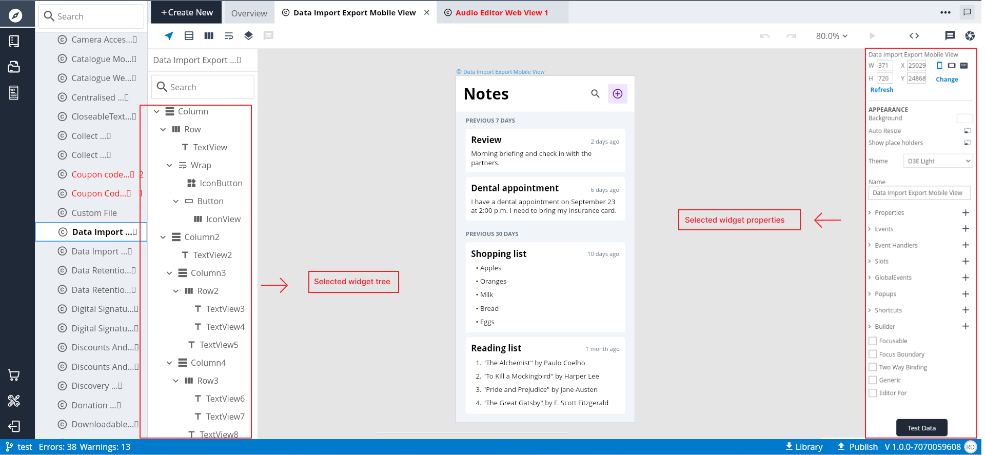
In D3E Studio, a "Page" represents a unit of the user interface (UI) that typically corresponds to a specific view or screen in your application. Pages are fundamental building blocks in creating the structure and layout of your application.
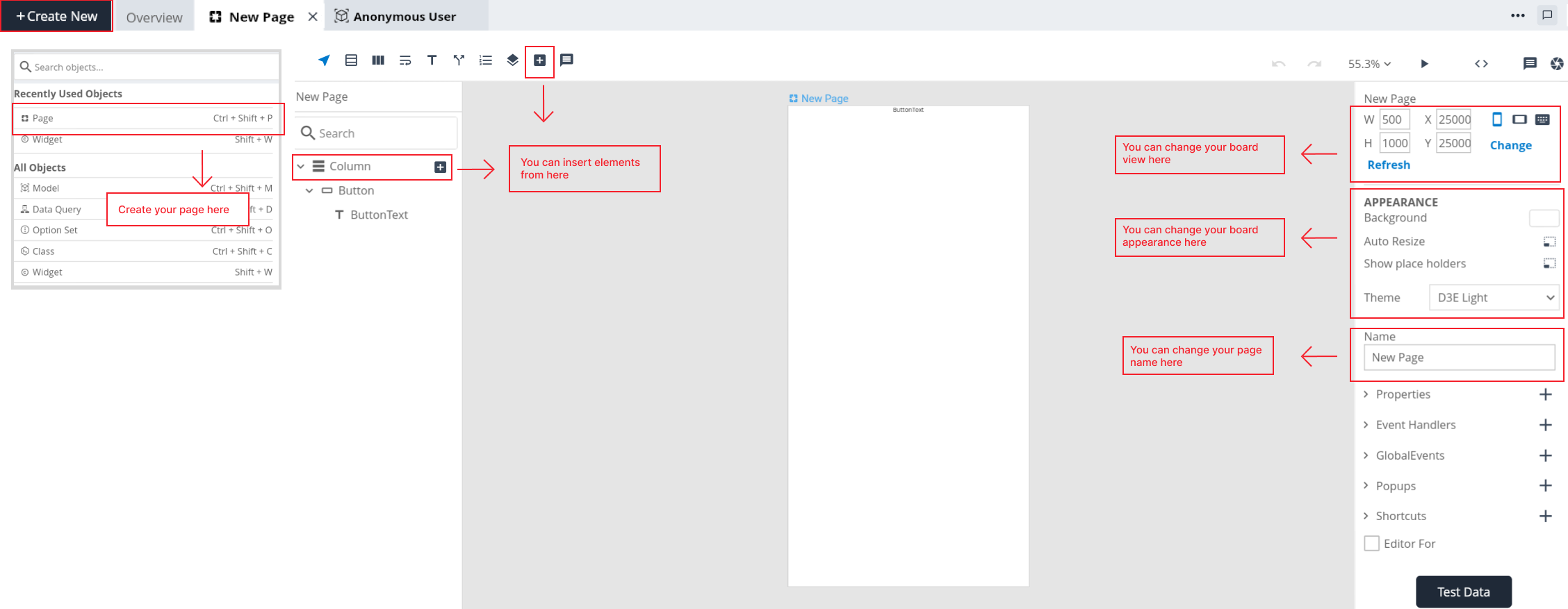
UI Composition: A page is composed of various widgets that define its visual and interactive elements. Widgets like logos, image blocks, forms, and other UI elements are assembled within a page to create a cohesive user experience.
Non-Reusability of Page Components: Unlike widgets, pages are often considered non-reusable. This is because the logic and structure of a page are typically specific to a particular view or screen in the application.
Routing Logic: Pages are associated with routing logic that determines when and how they are displayed to the user. Routing involves mapping URLs or user actions to specific pages within the application.
D3E Studio likely provides features to configure the routing for pages, specifying how users navigate between different views.
User Interface Elements: Pages define the arrangement and layout of various UI elements. These elements can include navigation bars, sidebars, content sections, and any other widgets needed to present information or gather input from the user.
Dynamic Content: Pages can dynamically load and display content based on user interactions or data retrieved from the backend. This dynamic behavior enhances the responsiveness and flexibility of the application.
Integration with Components: While pages are often non-reusable, they can integrate and reuse widgets from the "Widgets" directory. This allows developers to maintain a balance between creating specific views for pages and leveraging modular, reusable components for common UI elements.
Overall, pages play a crucial role in defining the structure and flow of the application's user interface. They serve as containers for assembling components and organizing the visual elements that make up different views within the application.
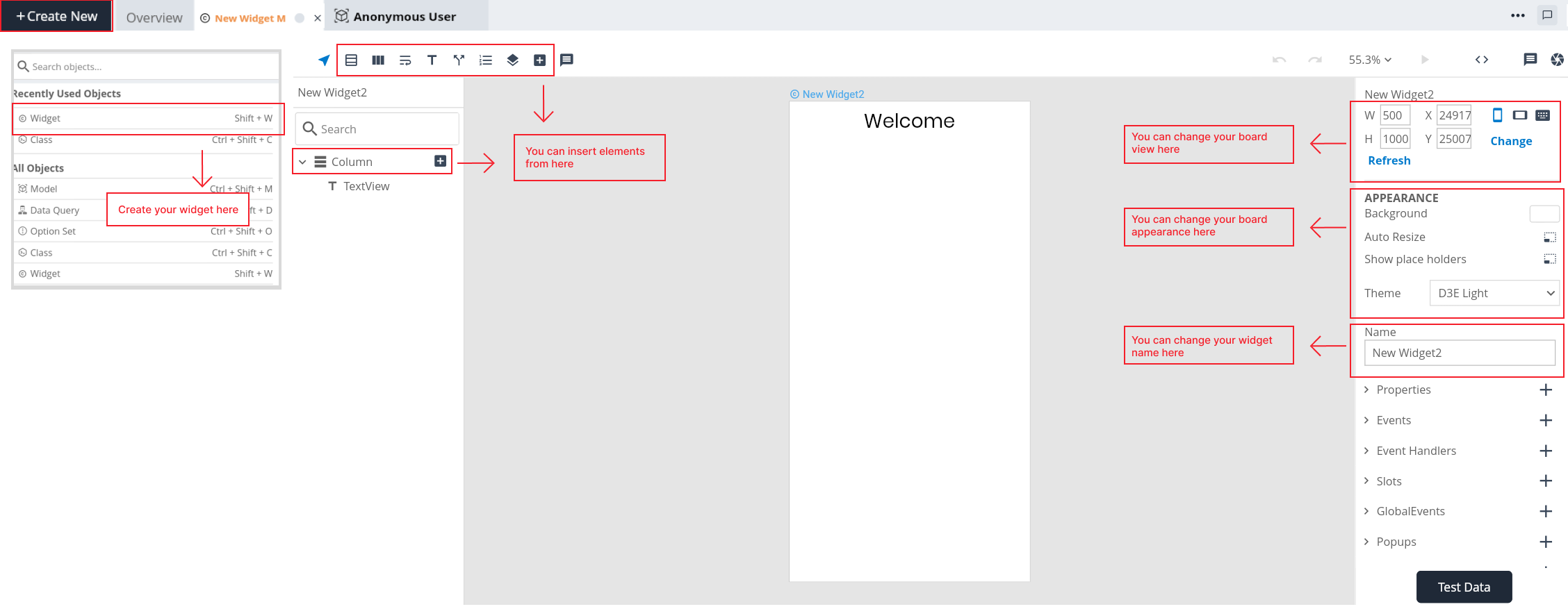
Key components of widgets
Dimensions : Change the widget board dimensions (Height, Width, X-axis, Y-axis) as you need. And you can also see a quick dimension changes on the canvas.
Changing Board view : Users have the flexibility to tailor their board view, allowing for seamless transitions between portrait and landscape orientations.
Keyboard shortcuts : Keyboard shortcuts offer a quick and efficient way to navigate and perform various actions.
Change: By clicking on "Change" you will have the option to select the desired device size from the available choices. Common device size options may include predefined configurations like Mobile, Tablet, Watch and Web/Desktop.
Refresh: Upon clicking "Refresh," the widget board will be reloads and if any elements which are not displayed on the widget board will appear.
APPEARANCE
Background:
User have the ability to give a "Background" color to the widget.
Auto Resize:
The "Resize" option in a widget typically refers to the ability to dynamically resize the widget based on its content or elements. This feature is particularly useful when the widget's content is dynamic, and you want the widget's size to adjust automatically to accommodate the changing content.
Show placeholders:
Activate this option to enable the display of placeholders.
Theme:
Select a "Theme" from available options. When you select a theme for a widget, it influences various aspects of the widget's presentation, including button styles, text styles, colors, form field styles, and more. It will be reflects based on the selected theme.
Name:
User can "Rename" a widget here as they want in their project.
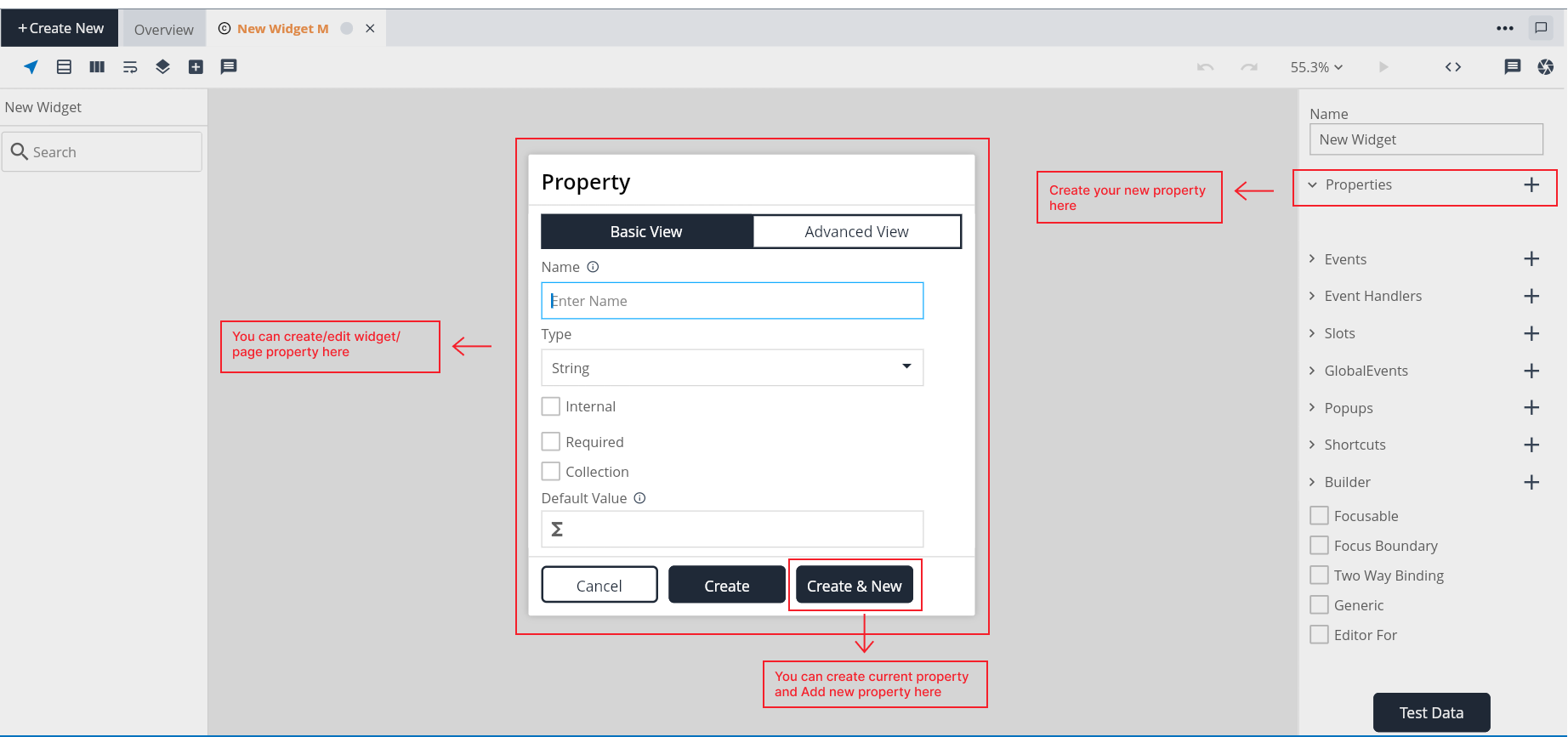
Property
A property refers to a variable designed to store data within a widget. These properties can either be internally assigned, capturing data generated within the widget, or externally provided, serving as a container for values supplied from external sources. Properties play a crucial role in shaping the behavior and functionality of widgets within the application.
Key components of Widget Property
1. Basic View
Name:
- When creating a new property, users can input their choosen name for the property. This name should be unique and adhere to any naming conventions or guidelines.
Type:
- Select the appropriate data type from the available choices. The type of a property specifies the kind of data it can hold. It can be a primitive data type, model, option set, struct, class.
- Significance: Type define the nature of the data the property can store, ensuring consistency and enabling D3E Studio to generate appropriate backend structures.
Internal:
- The term "Internal" in a widget refers to a property that is utilized within the component itself and is not directly exposed for external manipulation.
- Significance: This type of property is often used for internal data management or to store values that are essential for the widget's functionality but do not need to be accessed or modified from outside the widget.
Required:
- The "required" property in widget specifies whether a particular property must have a value assigned. If a property is marked as required, it means that when creating or updating an object based on this widget, a value for this property must be provided, and leaving it empty would result in a failure, ensuring essential data is captured.
- Significance: Marking a property as required ensures that crucial data is captured, enhancing the reliability and completeness of the information stored in the object.
Collection:
The "collection" property in widget indicates that a particular property can hold multiple values, essentially turning it into a list or an array. This is useful when a property needs to represent a collection of items rather than a single value.
Significance: Marking a property as a collection allows it to store multiple instances of the specified type, accommodating scenarios where multiple items are associated with a single entity.
Default Value:
The "default value" property in widget allows you to specify a predefined value that a property should take if no explicit value is provided during object creation. This default value serves as a fallback, ensuring that the property always has a valid initial value even if not explicitly set.
Significance: Default values provide a way to initialize properties, ensuring they have meaningful initial data even when not explicitly set.
2. Advanced View
Description:
- Users have the option to provide description for properties. Adding a description is a best practice for enhancing the understanding of a property's purpose, usage, or any additional context.
Fetch Data:
Enabling the fetchData option allows users to generate queries and access properties from reference models. This functionality is valuable for retrieving and utilizing data from external sources within your widgets.
When you enable the "Fetch Data" property in the widget component, it signifies that the widget should retrieve and make available the data associated with the referenced models.
Stylable:
- The "Stylable" property in a widget provides users with the capability to create custom styles for the specified property within the widget.
- Set the "Stylable" property to true, indicating that users can create custom styles for the associated property.
Computed:
- The term "Computed" typically refers to computed properties or computed fields within a widget. Computed properties allow you to define dynamic values that are calculated based on the values of other properties within the same widget. These computed properties are not stored directly in the database but are calculated on-the-fly when requested.
Computation:
Computation refers to the logic or formula that is written to calculate the value of a computed property. It is the computational logic that determines how the dynamic value is derived.
Purpose: Computation allows developers to express complex calculations, transformations, or conditional logic to generate the desired output for a computed property.
Implementation: Computation logic is written in a specific syntax or language, depending on the framework or language used for widget development. Developers can express mathematical operations, conditions, and other computations to define the behavior of the computed property.
OnChange:
Adding OnChange Handler: Clicking on "OnChange" will add the OnChange event handler to the widget. This event handler can be found in the widget's event handlers.
The OnChange event handler is a mechanism that enables developers to specify custom code or logic that will be executed when a particular property within the widget undergoes a change.
Purpose: The OnChange event handler is useful for scenarios where developers want to respond to changes in a property by triggering additional actions or updates within the widget.
User-Defined Logic: Developers can write their own custom logic within the OnChange event handler to define what actions should be taken when the associated property experiences a change.
Deletion: Users have the ability to delete an OnChange event handler if it is no longer required. This flexibility allows for the modification and refinement of the widget's behavior over time.
What are various ways to Fetch data?
There are several ways to fetch data into UI Component they are With using data query "Query.getClassName" while create a property in widget if you need to get inner structer of data in page you must create a fetch data property in component. Simply with using RPC methods we may fetch data into UI.
How to Fetch data using Data query?
To fetch data using Data Query we need to follow several steps. They are:
Steps to create a Property
- Step 1: Click add symbol in the canvas beside property.
- Step 2: Give a name to property.
- Step 3: Select a data type from the available options.
- Step 4: Enable Internal checkbox (optional).
- Step 5: Enable Required checkbox (optional).
- Step 6: Enable Collection checkbox (optional).
- Step 7: Give default value to the property.
- Step 8: Give a suitable description to the property (optional) in advanced view.
- Step 9: Enable Fetch data checkbox (optional) in advanced view.
- Step 10: Enable Stylable checkbox (optional) in advanced view.
- Step 11: Enable Computed checkbox (optional) in advanced view. Write a computation to the property in advanced view.
- Step 12: Click on create button to create a property, or click on create&new to create another new property.
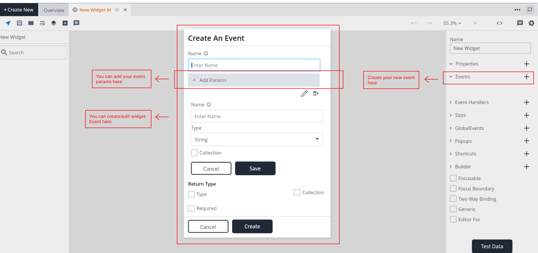
Event
Events refer to changes or actions that occur within a Component or Page. These events can be triggered by user interactions, such as pressing a button or tapping on a screen, or they can occur automatically based on specific conditions.
Key components of Event
Name:
- When creating a new event, users can give their choosen name for the event. This name should be unique and adhere to any naming conventions or guidelines.
Add Param:
Here you can add parameters for the event.
Name: User have ability to give a unique parameter name.
Type: Select the appropriate data type from the available choices. The type of a property specifies the kind of data it can hold. It can be a primitive data type, model, option set, struct, class.
Collection: The "collection" property in event indicates that a particular parameter can hold multiple values, essentially turning it into a list or an array. This is useful when a parameter needs to represent a collection of items rather than a single value.
Edit: You can edit the param details as you need.
Delete: If this param is not useful then you can delete that parameter from the event.
Return type
Required:
The "Required" attribute in the Return Type specifies whether the return value from the event is mandatory or optional.
Significance: Marking a return value as required helps enforce consistency in the usage of the event, ensuring that developers handle the return value appropriately.
Type:
- The "Return Type" indicates the data type of the value that the event will return.
- Depending on the nature of the event, the return type could be a primitive data type, model, option set, struct, class.
Collection:
- The "Collection" attribute in the Return Type specifies whether the return value is a single item or a collection (list) of items.
Steps to create an Event
- Step 1: Add the event.
- Step 2: Give a name to event.
- Step 3: Click add param (if required). Write param name & type
- Step 4: Enable Return Type checkbox(if required).
- Step 5: Enable Return Type Required checkbox(if required).
- Step 6: Enable Collection checkbox(if required).
- Step 7: Click on create button to create an event.
Steps to create an Event Param
- Step 1: Click "Add Params" in the events popup.
- Step 2: Give a name to the param.
- Step 3: Choose a data type from the available options.
- Step 4: Enable Collection checkbox(if needed).
- Step 5: Click on save button to create an event param.
Common Events
1. onPressed: Triggered when a button or interactive element is pressed.
2. onChange: Occurs when the value of an input or component changes.
3. onTap: Fired when a user taps on a particular area or component.
Event Handler
An event handler is a piece of code associated with a particular event. It defines what actions should be taken when a specific event occurs. Events can be triggered by user actions (e.g., button clicks, mouse movements), system processes, or other external factors. Event handlers are used to define the behavior of a component in response to different events, allowing developers to create dynamic and interactive applications.
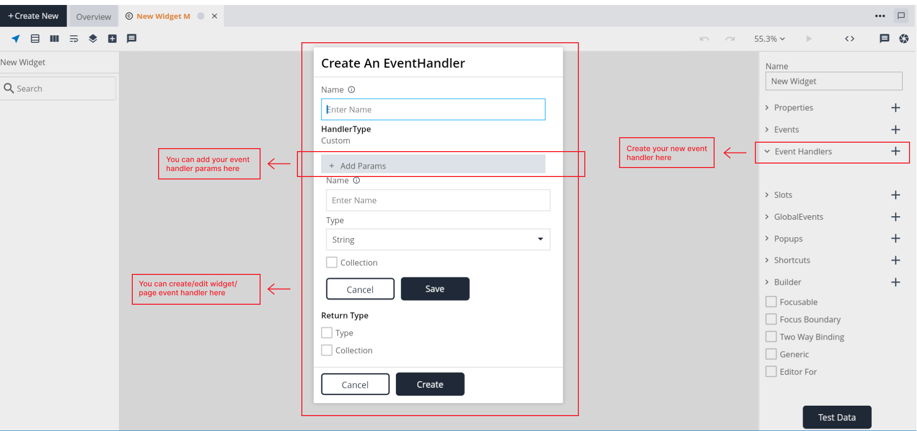
Key components of Event Handler
Name:
- When creating a new event handler, users can input their choosen name for the event handler. This name should be unique and adhere to any naming conventions or guidelines.
Handler Type:
- Handler type defines type of the event handler. There are 8 types of handler type:
1. Custom:
- Description: Used for creating custom event handlers with user-defined logic.
- Use Case: Ideal when the developer needs complete control over the behavior associated with a specific event.
2. OnStateChange:
- Description: Triggered when there is a change in the state of the widget.
- Use Case: Useful for handling events tied to changes in the internal state of the widget.
3. OnPropChange:
- Description: Activated when there is a change in the properties of the widget.
- Use Case: Appropriate for responding to alterations in the properties of the widget.
4. OnEvent:
- Description: Activated when the event is explicitly triggered using the TriggerEvent action in the logic.
- Use Case: Useful for custom events triggered within the widget's logic.
5. OnPopupClose:
- Description: Activated when a popup associated with the widget is closed.
- Use Case: Useful for defining actions to be taken when a popup is closed.
6. OnGlobalEvent:
- Description: Triggered in response to global events across the application.
- Use Case: Suitable for handling application-wide events that impact the widget.
7. OnBehaviour:
- Description: Used when the behavior of the widget needs to be altered.
- Use Case: Appropriate for responding to changes in the behavior or characteristics of the widget.
8. OnIntent:
- Description: Activated when there is an intent related to the widget.
- Use Case: Useful for handling specific intents associated with the widget's functionality.
Add Param:
Name: User have ability to give a unique parameter name.
Type: Choose the data type from the available options. The type of a property specifies the kind of data it can hold. It can be a primitive data type, model, option set, struct, class.
Collection: The "collection" property in eventhandler indicates that a particular parameter can hold multiple values, essentially turning it into a list or an array. This is useful when a parameter needs to represent a collection of items rather than a single value.
Edit: You can edit the param details as you need.
Delete: If this param is not useful then you have the to delete the param from the event handler.
Return type
Required:
The "Required" attribute in the Return Type specifies whether the return type value from the eventhandler is mandatory or optional.
Significance: Marking a return value as required helps enforce consistency in the usage of the eventhandler, ensuring that developers handle the return value appropriately.
Type:
- The "Return Type" indicates the data type of the value that the eventhandler will return.
- Depending on the nature of the eventhandler, the return type could be a primitive data type, data type, model, option set, struct, class.
Collection:
- The "Collection" attribute in the Return Type specifies whether the return value is a single item or a collection (list) of items.
Steps to create an Event Hanlder
- Step 1: Add the event handler.
- Step 2: Give a name to event handler.
- Step 3: Click add param (if required). Write param name & type
- Step 4: Enable Return Type checkbox (if required).
- Step 6: Enable Collection checkbox (if required).
- Step 7: Click on create button to create an event handler.
Steps to create an EventHandlerParam
- Step 1: Click "Add Params" in the eventhandlers popup.
- Step 2: Give a name to the param.
- Step 3: Choose a data type available from the options.
- Step 4: Enable Collection checkbox(if required).
- Step 5: Click on save button to create an eventhandler param.
When to create an EventHandler?
Create an event handler when you want to define specific actions or behaviors in response to a particular event. Here are some scenarios when you might want to create an event handler:
1. Button clicks: When you want to execute certain actions when a button is clicked, such as submitting a form, navigating to another page, or updating the UI.
2. Input Changes: When you want to respond to changes in the value of an input field, like validating input or updating related components.
What are Custom EventHandlers?
- Custom event handlers like 'onInit' and 'onDispose' are used for executing methods automatically before a page loads or after it's disposed.
- Custom event handlers are allow you to specify parameters and return types, providing flexibility in handling different scenarios.
- Custom event handlers are created by specifying them on the right side of a component. This designates them as custom handlers rather than predefined ones.
What is OnInit? When do we need to use it?
The onInit event is called when the component is initialized, allowing you to perform setup operations.
What is OnDispose? When do we need to use it?
The onDispose event is used to perform specific operations before a component is closed, such as changing property values, prompting users to save their work, or any other cleanup tasks.
Slot
Slots can be designed to accept a single child or multiple children. This depends on the requirements of the component and the desired behavior.
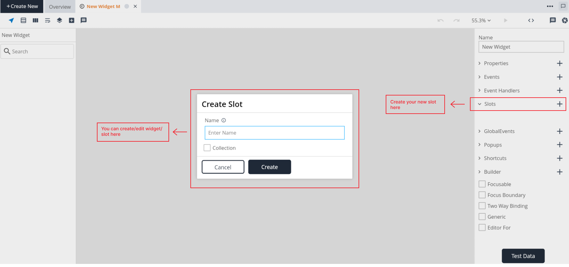
Key components of Slot
Name:
- When creating a new slot, users can input their choosen name for the slot. This name should be unique and adhere to any naming conventions or guidelines.
Collection:
- The "collection" property in slot indicates that a particular slot can hold multiple values, essentially turning it into a list or an array. This is useful when a slot needs to represent a collection of items rather than a single value.
When to create slots in widgets?
- The primary reason for using slots is when the widget doesn't have knowledge of the content it will display. Slots act as placeholders where users of the widget can inject their content.
- By creating slots, widget designers allow users to customize the content that will be displayed in specific areas of the widget.
What is the difference between child slot and children slot?
1. Child Slot :
- When a new child is added to the child slot, it replaces the existing child. The child slot doesn't accumulate multiple children; it always displays the most recently added child.
2. Children Slot:
- It implies that you can add multiple child widgets or elements, and they won't be replaced by each other. This is useful when you want to have a collection of child widgets within a parent widget.
Steps to create a Slot
- Step 1: Add the slot.
- Step 2: Give a name to the slot.
- Step 3: Enable Collection checkbox(if needed).
- Step 4: Click on create button to create a slot.
Global Event
Global events are not specific to a particular component or widget; instead, they have application-wide significance. These events can be utilized across different components, widgets, or other elements within the project. Developers can define event handlers specifically for global events. Global events typically have consistent and well-defined names to ensure clarity and standardization.
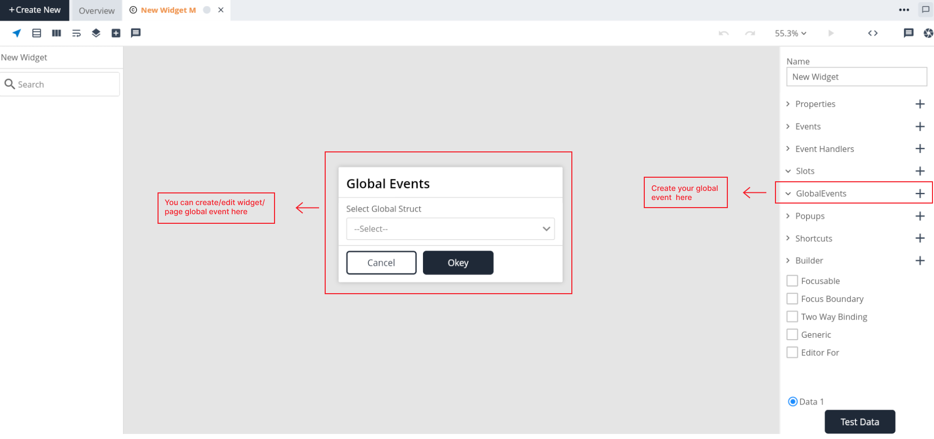
Key components of Global Event
Global Struct
Steps to create a Global Events
Step 1: Add global event.
Step 2: Select a global struct from available options.
Step 3: Click on ok button to create a global event.
Popup
A popup in a widget refers to a user interface element that appears on top of the existing content, usually to display additional information, gather input, or present options without navigating away from the current context. Creating a popup in a widget involves defining its properties, behaviors, and appearance.
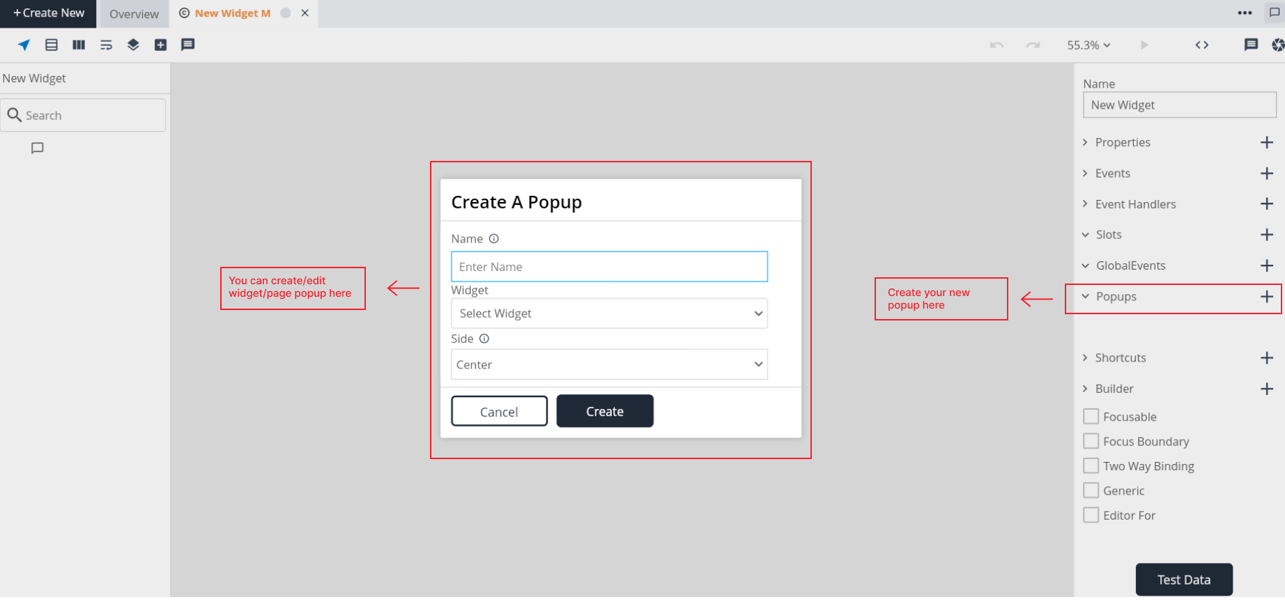
Key components of Popup
Name:
- When creating a new popup, users can input their choosen name for the popup. This name should be unique with in the widget.
Widget: -The "Widget" property allows you to select the widget that you want to display as a popup. Choose an existing widget from your project or create a new one specifically for use as a popup.
Side:
The "Side" property determines the side of the target node where the popup should be displayed.
Specify whether the popup should appear on the top, bottom, left, right, or center side of the target node.
Side values:
- Center : When 'center' is selected, the desired popup will appear at the center of the screen.
- Top : When 'top' is selected, the desired popup will appear at the top of the target.
- Left : When 'left' is selected, the desired popup will appear at the left of the target.
- Right : When 'right' is selected, the desired popup will appear at the right of the target.
- Bottom : When 'bottom' is selected, the desired popup will appear at the bottom of the target.
Target:
- The "Target" property identifies the node or element on which the popup will be anchored or triggered.
Steps to create a Popup
- Step 1: Click add symbol in the canvas beside popup.
- Step 2: Give a name to the popup.
- Step 3: Select the widget available from your list.
- Step 4: Select a side value from the list.
What is autoclose in popup?
Auto-close popup functionality means that the popup will automatically close when you click outside of its boundaries.
Shortcut
Widget shortcuts in D3E Studio allow users to create quick access to specific widgets by associating them with keyboard shortcuts. This guide walks you through the process of creating and managing widget shortcuts.
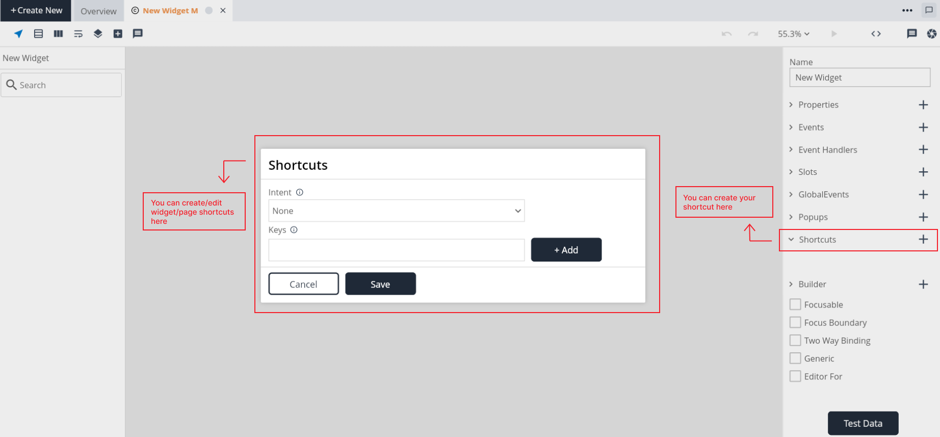
Key components of Shortcut
Intent:
- Intents define the behavior associated with the shortcut.
- From the list of intents, select the relevant intent that aligns with the action you want the shortcut to perform for the widget.
Key:
- Specify the keyboard keys you want to assign to the shortcut.
- Choose key combinations that are intuitive and easy to remember.
Steps to create a Shortcut
- Step 1: Add shortcut
- Step 2: Select an intent from the available intents.
- Step 3: Enter a key which you want to use as shortcut key and click on "Add".
- Step 4: If you want to add another key same enter the key and click on "Add".
- Step 5: Save the shortcut
Builder
The "Builder" property determines the build configuration for the widget, influencing its structure, appearance, and behavior. It is an essential aspect of widget development.
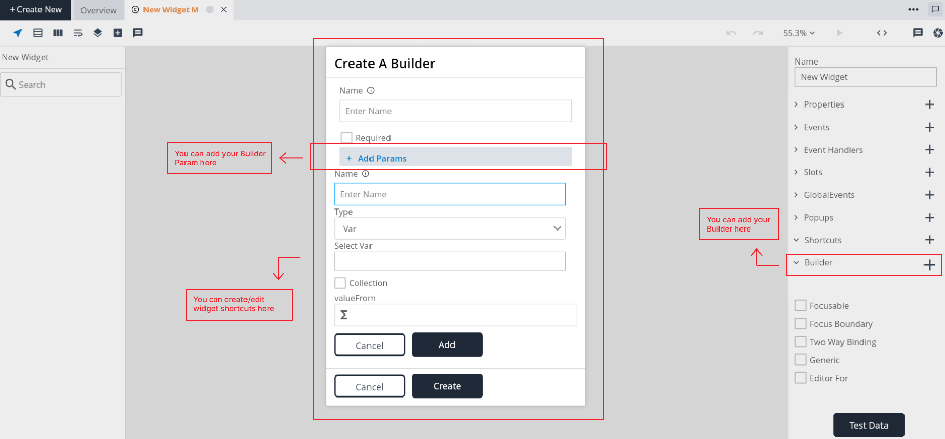
Key components of Builder
Name:
- When creating a new builder, users can input their choosen name for the builder. This name should be unique and adhere to any naming conventions or guidelines.
Required:
- The "Required" attribute in the Builder specifies whether the builder is mandatory or optional.
Type:
- Select the appropriate data type from the available choices.
- The type of a parameter specifies the kind of data it can hold. It can be a primitive data type, model, option set, struct, class, var.
Collection:
- The "collection" property in builder indicates that a particular builder can hold multiple values, essentially turning it into a list or an array. This is useful when a builder needs to represent a collection of items rather than a single value.
Value From
Steps to create a Builder
Step 1: Add builder in the widget.
Step 2: Give a name to the builder.
Step 3: Enable Required checkbox (if needed).
Step 4: Click "Add Param" (if needed).
Step 5: Click on create button to create a builder.
Steps to create an BuilderParam
- Step 1: Click "Add Param".
- Step 2: Give a name to the param.
- Step 3: Choose a type available from the options.
- Step 4: Enable collection checkbox (if needed).
- Step 5: Click on Add button to create a builder.
Focusable:
Focus Boundary:
Two way Binding:
Two-way binding is a mechanism that not only displays information to the end user but also enables the end user to make changes to the underlying data through the user interface. It establishes a dynamic link between the data source and the UI, ensuring that updates in one are reflected in the other. However, there are scenarios where the end user should not be permitted to modify certain information. In such cases, it's advisable to avoid using two-way binding for that specific data to maintain control over the information displayed.
Generic:
Editor For:
The "Editor For" feature is a functionality that allows developers to tailor the editor specifically for a particular widget or component. This feature is particularly useful when working with form components or interactive elements where custom validation, error handling, or other specific behaviors are required.
Here you need to select the model as a "Editor For" for the widget.
Widget Editor
- Appearance: The "Appearance" editor in D3E Studio plays a crucial role in customizing the visual aspects of widgets. It provides a set of properties that allow you to control the appearance of individual widgets, ensuring a cohesive and visually appealing user interface. Let's delve into the two main sections of the "Appearance" editor: "Widget Properties" and "General Properties."
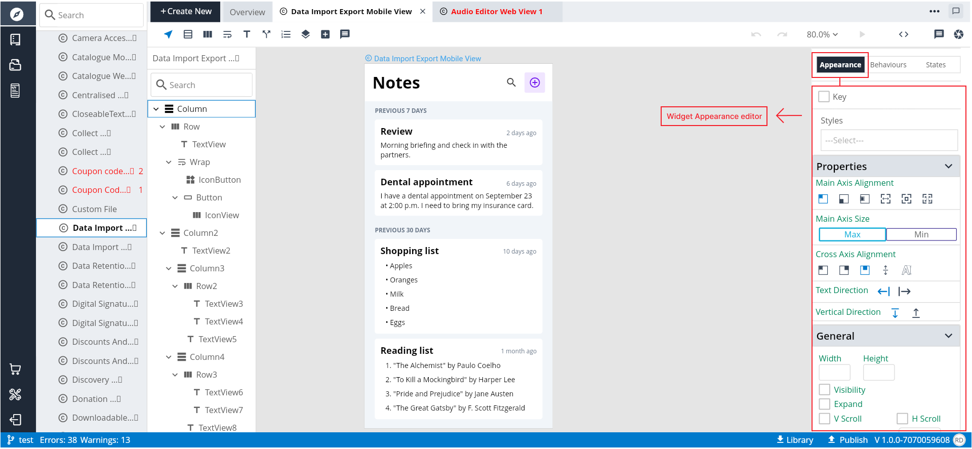
1. Widget Properties:
**a. Styles:**
The "Styles" section within Widget Properties enables you to choose or customize the specific style for the selected widget. This could include predefined styles.

**b. Alignments:**
Alignment properties control how the content within the widget is positioned. This includes options for horizontal and vertical alignment, ensuring that the widget's content is visually balanced.

**c. Inputs:**
The "Inputs" section allows you to configure how the widget responds to user input. This could involve defining values, actions.
2. General Properties:
**a. Sizes:**
General size properties apply universally to all widgets. This could include settings for width, height, padding, and margin, providing control over the overall dimensions and spacing of the widget.

**b. Background Color:**
The background color property in the "General Properties" section sets the background color for the widget. This property can be particularly impactful for defining the overall visual style of the widget.

**c. Text Style:**
Text style properties influence the appearance of text within the widget. This includes settings for font family, font size, font weight, and other typography-related attributes.

**d. Other General Styling:**
Additional properties related to borders, shadows, and other general styling options may also be found in this section, offering a comprehensive set of tools for refining the widget's appearance.
In summary, the "Appearance" editor in D3E Studio serves as a powerful tool for fine-tuning the visual presentation of widgets, promoting consistency, and streamlining the design process.
Behaviours
The "Behaviors" tab of the widget in D3E Studio is a central place where developers can define the interactive and responsive aspects of the widget. It encompasses various events and behaviors that dictate how the widget should respond to user input, changes in focus, gestures, and more. Let's explore the different categories and events available in the "Behaviors" tab:
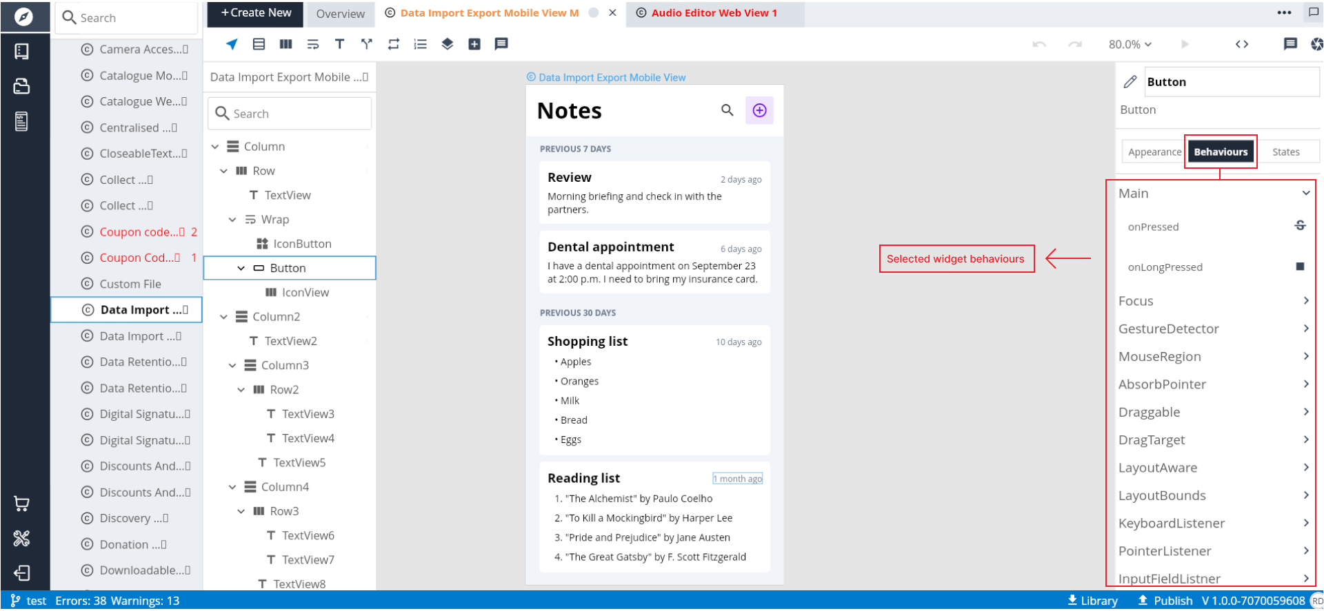
1. Main Events: These are fundamental events that capture interactions with the widget. Examples include click events, double-click events, and events related to changes in the widget's state.
2. Focus Events: These events pertain to the focus state of the widget. Focus events can be triggered when the widget gains or loses focus, allowing for specific actions or behaviors to be associated with focus changes.
3. Gesture Detector: The Gesture Detector provides a way to handle complex gestures such as tapping, long press, scaling, etc. This allows developers to create interactive experiences beyond simple tap interactions.
4. Mouse Region: Mouse Region events are related to interactions with the mouse cursor. This includes hover effects, click events, and other mouse-specific interactions.
5. Absorb Pointer: Absorb Pointer is a behavior that prevents interaction events from reaching underlying widgets. This can be useful in scenarios where you want to capture and handle all interaction events within a specific widget.
6. Draggable: Draggable events enable the widget to be dragged by the user. This includes the start, update, and end events associated with dragging.
7. Drag Target: Drag Target events are related to the drop target when using drag and drop functionality. These events allow developers to define actions when a draggable item is dropped onto the widget.
8. LayoutAware: LayoutAware events are associated with changes in the layout of the widget. This can include events triggered when the widget is resized or repositioned.
9. Layout Bounds: Layout Bounds events provide information about the bounding box or dimensions of the widget. Developers can respond to changes in the widget's size or position.
10. Keyboard Listener: Keyboard Listener events allow the widget to respond to keyboard input. This includes events triggered when specific keys are pressed or released.
11. Inputfield Listener: Inputfield Listener events are specific to input fields within the widget. They capture events related to user input within these fields.
12. Focusable: Focusable events are associated with the focus state of the widget. These events allow developers to define behaviors when the widget becomes focusable or loses focusability.
Overall Benefits:
Interactivity: The "Behaviors" tab empowers developers to create interactive and responsive widgets by defining how the widget responds to various events.
Event Handling: Developers can handle a wide range of events, from simple clicks to complex gestures, providing a rich user experience.
Customization: The tab allows for detailed customization of how the widget behaves in response to different user interactions and system events.
Consistency: By centralizing event handling in the "Behaviors" tab, developers can maintain a consistent approach to interaction across the application.
In summary, the "Behaviors" tab in D3E Studio is a versatile tool for defining the interactive and responsive aspects of widgets, ensuring a dynamic and engaging user interface.
- States:
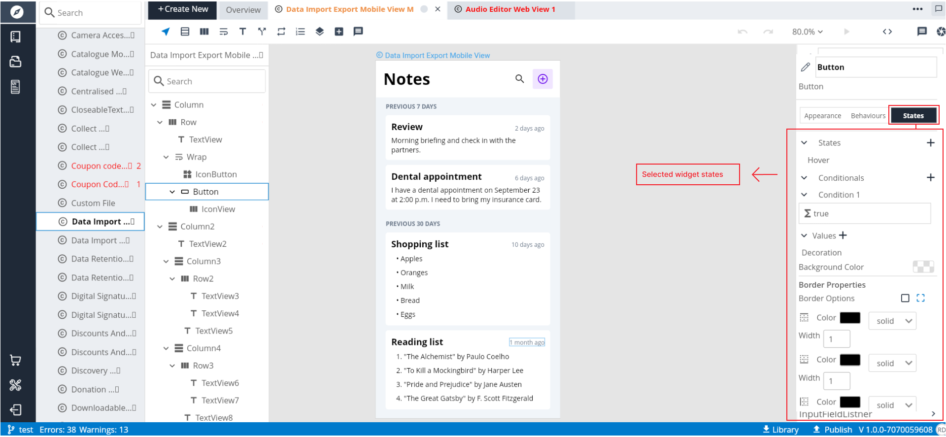
States allow developers to create dynamic and responsive user interfaces by specifying different visual representations or behaviors based on conditions.
States serve to define different appearances or behaviors of a widget based on specific conditions. This could include changes in response to user interactions like hovering, clicking, or other custom triggers. Let's delve into the key aspects of states within a widget:
**1\. State**

**Name:**
The "Name" property identifies the state within the widget. It serves as a reference for developers to distinguish one state from another.

**Description:**
The "Description" provides additional context or information about the purpose of the state. This can be helpful for documentation and collaboration among team members.

**Type:**
The "Type" of a state indicates whether it is associated with primitive type or any other object type.

**2\. Condition**

The "Condition" is a crucial aspect of a state as it defines when the state should be activated. Developers specify a condition based on the type of the state. For instance, a state might be triggered when the condition execute.
In conclusion, the concept of states in D3E Studio empowers developers to create visually engaging and interactive widgets, contributing to a more dynamic and user-friendly application interface.
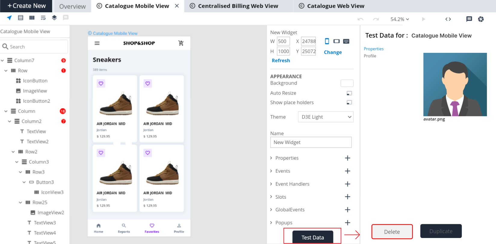
TestData
Test data in D3E Studio serves as a mechanism to evaluate how a widget or component performs when provided with specific input. It allows developers to simulate real-world scenarios and observe how the widget behaves under different conditions.
Steps to create a widget
Step 1: Select widget in a "create new " tab.
Step 2: Rename a widget as as per your requirement (Optional).
Step 3: Insert any widget from the tool bar like Column or Row or Wrap or Stack as per your design then that widget will be the parent for all the widgets.
Step 4: Next you can insert the widget from the Widgets popup by clicking on the "Add Icon" of any CNode in the widget tree.
Step 4.1.: You can change the CNode name in its respective editor on the right side.
Step 5: In the widgets popup you can search your desired widget and implement your widget as per your choice.
Step 6: You can apply the styles for the widgets you want by selecting that widget CNode in the widget tree.
Step 6.1. When you select the widget CNode then it will show you the editor for that respective widget on the right side.
Step 6.2. Here you will have 3 tabs i.e, Appearance, Behaviour, States. You will find the style option in the Appearance tab. Here select the style from available options.
Step 6.3. You also can give all other inputs, appearance styles, sizes, etc in Appearance tab.
Step 7: Go to the Behaviours tab, you use this tab for actions, user inputs, changes in focus, gestures and more...
Step 8: Go to states tab, you can use this tab for creating states like hover, selected, focus and more...
-
ON THIS PAGE
- Introduction
- Key components of widgets
- APPEARANCE
- What are various ways to Fetch data?
- How to Fetch data using Data query?
- Steps to create a Property
- Steps to create an Event
- Steps to create an Event Param
- Steps to create an Event Hanlder
- Steps to create an EventHandlerParam
- When to create an EventHandler?
- When to create slots in widgets?
- What is the difference between child slot and children slot?
- Steps to create a Slot
- Global Struct
- Steps to create a Global Events
- Steps to create a Popup
- What is autoclose in popup?
- Steps to create a Shortcut
- Value From
- Steps to create a Builder
- Steps to create an BuilderParam
- Steps to create a widget