
Styles
Introduction
Styles encompass various aspects of the project.This could include defining properties such as colors, fonts, spacing, and other visual characteristics that determine the appearance of widgets.The created styles are reusable and can be applied to a widget in multiple another widgets. This promotes consistency in the visual design across different parts of the application.
Consistent Appearance:
- The configured style ensures a consistent visual appearance for widgets of the selected type across the application.
Override Options:
- While the style provides a baseline, users may have the option to override these styles for specific instances of widgets, allowing for flexibility in design.
Global Impact:
- Changes made to the style have a global impact on all instances of the specified widget type, promoting uniformity in design.
Key Features
Name:
Every style is uniquely identified by a name within the API.
Description: Here you can give a detailed and informative explanation or representation of Style. It is a narrative that provides additional information to help understand, identify, or explain about the style.
Documentation
Allows users to document and store information about specific Style in the project. Write notes, explanations, or guidelines related to Style. Facilitates collaboration by providing a shared space for notes and documentation.
Widget: Users can select widgets from the list for which you want to create style and apply their custom color, fonts, spacing, to the choosen elements in the right side.
Selector: Selectors in d3e are used to target specific elements within the user interface for styling purposes. These selectors allow you to define styles for individual widgets, combinations of widgets, or elements with specific tags. The following types of selectors are available in d3e:
Types of Selector or Combinator in D3E:
Default Selector
Selector
1. Widget Selector
Selects all elements that have given Widget
It has a sub property called "Widget".
Syntax:
WidgetNameExample:
RowExample:
  Style {
    name 'IconButtonRef'
    component IconButton
    items [
      {
        selector 'IconButton'
        values {
          backgroundColor '@c1'
        }
      }
    ]
  }
2. Tag Selector
Selects all elements with the given tag
It has a sub property called "Tag name".
Syntax:
.TagExample
.errorExample:
  Style {
    name 'InputFieldError'
    component InputField
    items [
      {
          selector '.error'
          values {
            activeColor '@c11'
            inActiveColor '@c11'
          }
      }
    ]
  }
Combinators
3. Descendant Combinator
The ' '(space) combinator selects nodes that are descendants of the first element
It has two sub propertys. They are:
1. Parent Widgets:
2. Child Widgets:
Syntax:
A BExample:
Row TextViewwill match allTextViewthat are inside aRowExample:
Style {
  name 'TextViewInRow'
  component TextView
  items [
    {
        selector 'Row TextView'
        values {
          fontSize '15.0'
          color '@c6'
          fontWeight 'w600'
        }
    }
  ]
}
4. Child Combinator
The
>combinator selects nodes that are direct children of the first element.It has two sub propertys. They are:
1. Parent Widgets:
2. Child Widgets:
Syntax:
A > BExample:
Row > TextViewwill match allTextViewthat are direct children of aRowExample:
  Style {
    name 'TextViewInRow'
    component TextView
    items [
      {
          selector 'Row > TextView'
          values {
            fontSize '15.0'
            color '@c6'
            fontWeight 'w600'
          }
      }
    ]
  }
5. Sibling Combinator
The
+combinator selects nodes that are the next sibling of the first element.It has two sub propertys. They are:
1. Parent Widgets:
2. Child Widgets:
Syntax:
A + BExample:
Row + TextViewwill match allTextViewthat are the next sibling of aRowExample:
  Style {
    name 'TextViewInRow'
    component TextView
    items [
      {
          selector 'Row ~ TextView'
          values {
            fontSize '15.0'
            color '@c6'
            fontWeight 'w600'
          }
      }
    ]
  }
6. Adjacent Sibling Combinator
The
~combinator selects nodes that are the next sibling of the first element.It has two sub propertys. They are:
1. Parent Widgets:
2. Child Widgets:
Syntax:
A ~ BExample:
Row ~ TextViewwill match allTextViewthat are the next siblings of aRowExample:
  Style {
    name 'TextViewInRow'
    component TextView
    items [
      {
          selector 'Row + TextView'
          values {
            fontSize '15.0'
            color '@c6'
            fontWeight 'w600'
          }
      }
    ]
  }
7. Column Selector
The
||combinator selects nodes that are in the given column.It has two sub propertys. They are:
1. Selector:
2. Widgets:
Syntax:
A || BExample:
.Name || TextViewwill match allTextViewthat are in the same column withNametag.Example
  Style {
    name 'tagTextViewInRow'
    component TextView
    items [
      {
          selector '.Name || TextView'
          values {
            fontSize '15.0'
            color '@c6'
            fontWeight 'w600'
          }
      }
    ]
  }
8. Pseudo classs
:hover
The
:hoverpseudo class selects elements when the mouse pointer is over them.:focus
The
:focuspseudo class selects elements when they have focus.It has a sub property called "Pseudoclass".
How to create a Selector or Combinator?
1. Select "Create selector" from Selector dropdown.
2. Selector popup will be shown. Select the desired selector.
3. When you select any selector then it will show another optons related to the selected selector or combinator.
3.1. Widget Selector: If you select the widget selector then you need to select widget from the widget drop down.
3.2. Tag Selector: If you select tag selector then you need to give tag name.
3.3. Descendant Combinator: If you select descendant combinator then you need to select Parent widget and Child widget.
3.4. Child Combinator: If you select child combinator then you need to select Parent widget and Child widget.
3.5. Sibling Combinator: If you select sibling combinator then you need to select Parent widget and Child widget.
3.6. Adjacent Sibling Combinator: If you select adjacent sibling combinator then you need to select Parent widget and Child widget.
3.7. Column Selector: If you select column selector then you need to select another selector which will have options Tag Selector, Pseudo class and widget selector.
3.7.1. If you select Tag Selector then give the tag name and select the widget.
3.7.2. If you select Pseudo Class then give pseudo class name and select the widget.
3.7.3. If you select Widget Selector then select the 2 separate widgets.
3.8. Pseudo Class: If you select f you select Pseudo Class then give pseudo class name and select the widget.
4. Click on Create. Then this selector will be shown in the selector dropdown.
These selectors, combinators, and pseudo-classes provide a powerful and flexible way to tailor the appearance of widgets and elements in the d3e system, allowing for a rich and dynamic user interface styling experience.
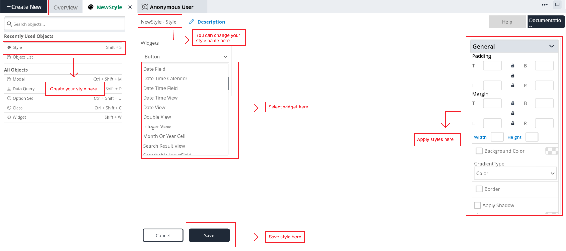
Steps to create a Style
Step 1: Select Style in "Create New" button.
Step 2: Give the style name as you want.
Step 3: Give the description for the style (Optional).
Step 4: Select a widget from widget dropdown list, for which you want to create style.
Step 5: When a widget is selected within the design interface, the right side of the screen displays a style editor containing settings that enable precise control over the widget's appearance and behavior.
Step 6: By default it will select a default selector, If you want any other desired selector then click on "Create Selector" button in the selector dropdown. And create your specific selector. For more information about selector creation check above.
Step 7: Go to style editor and change the properties, this could include font size, color, spacing, or any other applicable styling attributes.
Step 8: Save the style object.
Step 9: Check whether style is saved or not in the styles list in the Explore tree.