
Theme
Introduction
Users can choose different themes to alter the visual appearance of the application. Themes may include variations in color schemes, typography, and other stylistic elements. Theme is used to change the look and feel of the application by selecting the default theme.
The theme specifies the color of the components, darkness of the surfaces, level of shadow, appropriate opacity of ink elements, etc. Themes let you apply a consistent tone to your screen.
Key Components of Theme
Name:
- Every theme is uniquely identified by a name within the project.
Description
- Here you can give a detailed and informative explanation or representation of theme. It is a narrative that provides additional information to help understand, identify, or explain about the theme.
Documentation
- Allows users to document and store information about specific Theme in the project. Write notes, explanations, or guidelines related to Theme. Facilitates collaboration by providing a shared space for notes and documentation.
Font size:
- Font size that allows users to apply a specific font size to text within the application. Users can adjust the font size of text elements within the application.
- Here mentioned font size is default font size within the application.
Font Family:
- Users can apply a specific font family to text elements within the application. This gives them the ability to customize the visual appearance of text by choosing different font styles.
- Here mentioned font family is default font family within the application.
Default style:
- Users can configure a set of visual styles for their application, which includes Buttons, Texts, Inputfields, and other design elements.
- The "default style" allows users to establish a standardized visual appearance for different widgets within their application. This configuration includes defining styles for various UI elements, ensuring a cohesive and aesthetically pleasing design.
- The "default style" can be applied to various types of widgets, including buttons, texts, input fields, and more. Users have the flexibility to choose and configure styles for different widget types
- The configured default style ensures a consistent visual appearance for widgets of the selected type across the application.
- The configured default style ensures a consistent visual appearance for widgets of the selected type across the application.
Background color:
- Setting the background color is an essential aspect of visual styling, allowing users to define the overall look and feel of their application.
- Users may have the option to set background colors for individual elements or components.
- Here mentioned background color is default background color within the application.
Text color:
- Users can customize the color of the text displayed within their application. This includes specifying the color of text for various elements like paragraphs, headings, buttons, etc.
- Setting the text color is a crucial aspect of visual styling, allowing users to define the appearance of text content in terms of color.
- Here mentioned text color is default text color within the application.
Tooltip Background color:
- The tooltip background color can be adjusted to match the overall color scheme of the application or to provide visual contrast for better readability.
- Users may have the option to set different background colors for tooltips associated with specific elements or types of content.
- Users may have the ability to dynamically change the tooltip background color, providing a responsive and interactive design.
- Here mentioned tooltip background color is default tooltip background color within the application.
Tooltip Text color:
- The ability to set the text color in tooltips is part of the overall styling features, contributing to a cohesive and visually pleasing design. Users may have the option to set different text colors for tooltips associated with specific elements or types of content.
- Here mentioned tooltip text color is default tooltip text color within the application.
Theme Colors:
- Theme colors in D3E Studio allow users to create, manage, and utilize a custom set of colors that can be used consistently across the entire project. These colors can be integrated into styles, widgets, pages, and various other elements, providing a unified and cohesive visual identity.
Key Concepts:
1. Add Color:
Users have the ability to create new colors according to their preferences. These colors serve as a part of the theme and can be used throughout the project.
2. Project-wide Usage:
Once a color is created, it can be applied and utilized across the entire project, offering consistency in design and appearance.
3. Color Codes:
Each created color is associated with a unique code (e.g., c1, c2, c3, etc.), simplifying the referencing process within the project.
4. Color Descriptions:
Users can provide descriptions for each color, offering insights into the intended use or purpose of a specific color.
5. Deletion of Unused Colors:
Unused colors can be deleted from the theme to maintain a streamlined color palette and reduce clutter.
Using Colors Across the Project:
- Apply the created colors in styles by referencing the color codes. For example,
color c1. - Use the theme colors in widget design to maintain a consistent color scheme throughout the application.
- Apply theme colors to page elements such as backgrounds, text, or borders to create a cohesive visual experience.
AI-Powered Theme Generation
D3E Studio AI can automatically generate comprehensive themes for your project:
- Context-Aware Colors: AI analyzes your project description and generates colors that match your industry and purpose
- Color Psychology: Colors are selected based on emotional goals and user demographics
- Unique Palettes: Each project receives a unique color palette tailored to its specific needs
- Gradient Support: Themes include colors optimized for gradient usage
- Accessibility: Generated themes ensure proper contrast ratios for accessibility
- Comprehensive Coverage: Creates 20-30 colors covering all UI states and use cases
Steps to Create a Theme
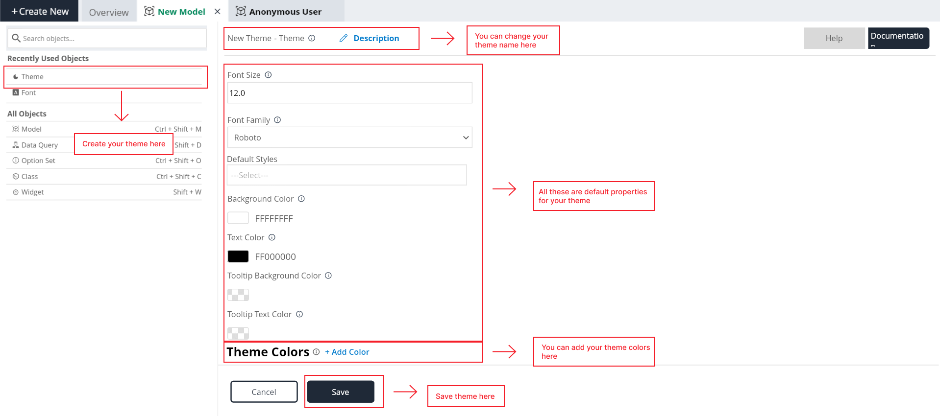
Step 1: Click on "Create New" button, it will open the popup here select theme.
Step 2: Give the Theme name as you want.
Step 3: Give the description for the style (Optional).
Step 4: Give the Font size as you required for your project.
Step 3: Select the Font Family from the available options.
Step 4: Select the Default styles collectively from the available styles.
Step 5: Select the background color from color picker tool.
Step 6: Select the text color from color picker tool.
Step 7: Select the Tooltip background color from color picker tool.
Step 8: Tooltip Text color Select the Tooltip text color from color picker tool.
Step 9: User can add desired colors to the project it will also show Hexa color codes for the added colors. They appear as c1, c2..etc,. in the list.
User can update a color using color picker which is useful for there project.
User can write a description for colors using description field.
User can also delete a color which is not useful for there project.
Step 10: Click on save. It should appear in the Themes list in the Explore tree.
-
ON THIS PAGE
- Introduction
- Key Components of Theme
- Steps to Create a Theme